Wednesday, November 28

Living in a billboard

Living in a Billboard - Aeroform Homes

No one could get bored of this architectural concept -- it's a home on a billboard! The rectangular Aeroform pod capsule situated behind the roadside advertisement makes use of potential living above ground.

The Aeroform was designed by Brendan O'Grady who won in the Ken Roberts Memorial Delineati… [More]

Tuesday, November 27

Electrolux Design Lab Finalists Biting Their Nails as the Winner is Announced/design lab


electrolux-shower.jpgThe winner of Electrolux's Design Lab 2007 competition will be announced tomorrow in Paris, and these are the final eight products hoping to win their creator 5,000€ ($7,435). The brief was to design something eco-friendly and sustainable for 2020, and sexiest is the Fog Shower by Joo Diego Schlmansky from Brazil, which consumes just two liters of water during a five-minute shower. It's all to do with the mist of microscopic water droplets, rather than a traditional shower, which uses around 20 liters for the same amount of scrub-up time.

electrolux design lab

This Year finalists

http://www.electrolux.com/campaigns/DesignLab2007/finalist_images/GO_FRESH_PROP.jpg
GO Fresh
Go Fresh by He Cheng Fei from Jiangnan University, China.
Go Fresh is an energy-saving fridge with 12 individual, honeycomd-shaped compartments that are temperature-controlled and automatically close air inlet when the correct temperature is reached.

http://www.electrolux.com/campaigns/DesignLab2007/finalist_images/CIRCOMPO_PROP.jpg

‘Circompo – Automatic food composter by Thanat Tengamnuay – King Mongkut’s University of Technology, Thonburi, Thailand’


The Fridge is pretty spanky too, no? [Electrolux Design Lab via MoCo Loco]

Jump Up Internet Rescue School Provides Rehabilitation for the Internet Addicted


P06c181107.jpgSouth Korea's Jump Up Internet Rescue School is the first of its kind, providing rehabilitation to those who cannot escape from the confines of the great interweb. Fittingly, South Korea is the world's foremost internet connected nation, with over 90% of homes having access to cheap, high speed broadband. Worryingly, this has been the reason for the establishment of a rehabilitation center for those who are addicted; the ready availability of the internet means users have grown seriously dependent on the World Wide Web's offerings.

As nations extend the reach of the internet throughout their own countries, South Korea's situation may serve as a warning beacon in light of further expansion. Some may deduce that preventative measures need to be implemented, prior to expansion, to avoid internet addiction becoming a global issue. The notion of a rehabilitation center of this kind certainly seems comical initially, but beyond its novelty value, concern surrounding addiction continues to grow. Indeed, the US (and other countries) have stipulated compulsive internet use as a tangible mental health issue.

With people literally dying from playing online games, this kind of treatment for the increasingly obsessed may eventually become the norm, but whatever the outcome, we cannot help but think this is an inevitable side effect of a medium that has so much to offer in a positive light. Responsible parenting and general lifestyle choices could ensure this problem is quashed right where it begins, but we doubt it. We would hate to think internet addiction becomes a real world problem, but with initiatives such as OLPC, might the internet eventually become the premier form of escapism? [New York Times]

via Gizmodo

Friday, November 23

Bad Taste Need Not Apply/Critical Shopper


A MATHEMATICIAN once told me that when long, complicated equations work, they give off a resonant, almost aural ping! By CINTRA WILSON

Hiroko Masuike for The New York Times


Hiroko Masuike for The New York Times

Hiroko Masuike for The New York Times

Pythagoras believed that everything in the universe could be translated into such deathless equations, and that the perfectly balanced, mathematic harmony of planetary movements corresponded to a symphony of such pings!

Nowadays it’s hard to be so excited about the physical world.

An all-pervasive corporate chain-store environment has absorbed and conquered the better part of individual retail expression. The guy who stocks the drugstore shelf with Nasonex is as disconnected from the choice of its placement as the one in charge of putting the bottle into its preprinted box, or the scientists responsible for the patent. Apart from fruit at the farmers’ market, there is little celestial music connecting most products to their sources; their indispensable symbolic place in the overall composition of life is not usually apparent.

The new Edit boutique was designed to give the shopper the feeling of being a welcome guest in an adorable two-story town house. When I entered, a lovely young woman rushed over to hang my coat with the easy friendliness of a good party hostess.

The Edit concept was explained with gentle enthusiasm. The owners, Valerie Feigen and Alissa Emerson, assembled their inventory by cherry-picking their favorite items from various designer collections. Their talent for this is immediately apparent. The shop is aglow with these little love affairs of selection, giving everything a slightly magical, soulful quality, as if it were made by elves or baked by your grandmother.

The first floor has an excellently truncated selection of handbags by notables like Anya Hindmarch alongside apparel by venerable designers like Michael Kors and Phillip Lim, mixed in with the work of up-and-comers like Charles Chang-Lima, whose fetching black patent blazer is the first magnetic item you reach out and touch ($1,595).

The centerpiece, set under an enormous chandelier made of bright golf-ball-size crystal spheres, is a series of jewelry cases pushed into an arrangement the size of a large dining table.

I’m not a big jewelry person. I can’t really relate to wearing $30,000 on one arm, but I will be the last to begrudge a lady such baubles, and the first to pull her wrist closer to my eye and say “Ooooh!” But everything in these cases is so surpassingly fine as to be mind-expanding on the subject of jewelry lust.

The assistants are charmingly passionate about it. Like girls allowed to play dress-up in a starlet’s steamer trunk, they breezily grab treasures and drape them casually on you and themselves, sharing the stories about them.

I was stunned by the work of Ray Griffiths, an Australian designer trained in the dying art of designing and repairing crowns for royalty. His bracelets are jaw-dropping: almond-size drops of blue topaz, smoky quartz and peridot, set in gold latticework reminiscent of Fabergé eggs and strung together into big modern flowers. They are simultaneously regal and trippy — something Prince William might buy to court the gilded bohemian Sienna Miller ($11,000 to $14,000).

A layered gold ring covered with tiny diamonds by Basel Jóias unsnaps and unfolds into a bracelet: two exceptional pieces in one ($4,500).

Hidden in all this diverse artistry is Edit’s ecumenical approach to price points. Thrown in alongside the ultraluxe baubles are less expensive items, like $300 lapis lazuli earrings, that look right at home with the costlier stuff.

And the clothes are great, too.

One popular item is a Phillip Lim thick gray knit tunic with stripes of metal pearls the weight of ball bearings. It looks like something Prince Harry would buy for Sienna Miller ($975).

Inspired little extras are discoverable throughout. Waiting inside the dressing room was a pair of black silk Louboutin mules for you to model with your dress, and marvelous flat over-the-knee Beguelin boots, should you prefer a swashbuckling Bardot look ($1,195).

Among neatly folded sweaters was a fist-size purple python Kotur evening bag, latched with tiny purple disco balls. Just sitting there fabulously like a runaway Easter egg. It wanted me to touch it.

It was a decadent. It was $390. Sometimes it’s deliriously nice to hold some little indulgence all filthy with opulence in your hand and rejoice in its electrifying impracticality. It was a hot little thrill, like rummaging though your sock drawer and finding a surprise kiss on the cheek from Jean Harlow.

In spite of all this glorious stuff, I bought basics: a fine-weave cotton pullover to wear every single minute, forever ($160) and black trousers with tailoring too perfect not to buy for $225.

Edit gives back something you didn’t know you missed, but once rediscovered, you wonder how you ever lived without: A retail environment that vibrates with the coherent harmonies of its own, um, intelligent design (for lack of a better term). It’s as much art installation as boutique, in that it provides a little vacation in someone else’s well-lighted consciousness. A golden thread connects every choice in Edit, from the paint on the walls to the cashmere opera gloves, joining everything together with the balanced tension, delicacy and natural genius of a spider web.

Such ecstatic pings! are all too rare in life ... .

Edit

1368 Lexington Avenue (near 91st Street);

(212) 876-1368.

THESIS A bad-taste-free zone, with a coffee area, a backyard garden and a personal shopping service, should you wish the crème de la crème-iest presented to you while you lounge.

ANTITHESIS No drawbacks, really, unless you have an aversion to the phonics of the Upper East Side (e.g., “It’s so soft!” pronounced “It’s sow sooh-uft!”). Generously egalitarian selections provide a little something swellegant for Eliza Doolittle, the Fair Lady she becomes and most gals in between.

SYNTHESIS Work done by someone who loves it is superior to similar work by someone who doesn’t.


via New York Times

to meet in the middle

Here’s something that gives a nice summary of what I’ve been up to lately. I first shared this little model last friday during the two lectures I had the honour to give that day (great planning eh?). One lecture was for brand managers and was called ‘why brands need products’. The other one was for product designers and was called ‘why products need brands’. Both presentations ended, albeit via a somewhat different route, on the same note: product and brand need each other like body and soul, and both are in precisely that area where organisation and end user meet. Here we go:

On one axis we have brand and product. Easy. Organisations have a certain place on this axis: they can be product focussed (R&D are leading, investments in IP, strong belief in technology) or they can be brand focused (marketing is leading, investments in brand building&communications, strong belief in brand narrative) or anywhere in between. It doesn’t matter. The statement here is that no matter where you are on the axis, a natural tendency is to move toward the extremes (centrifugal forces). And that it’s worthwhile to consider the opposing force. (centripetal forces)
Because when you become too brand focussed you start to loose the proof for your claim; you start to make promises without being able to fulfil them anymore. And if you become too product focussed you start to lose soul. You become a technocrat, forgetting that it’s people you’re dealing with and that it’s meaning you should be looking to offer, not features.
the brand-product axis
Then there’s a second axis. Of course.
On one end we have the organisation and on the other we have the end-user. Again, organisations (with their brand and products) have certain place on the axis. And again, the natural tendency is to grow toward the extremes (centrifugal forces): to become either very outward focused (strong focus on consumer research, user centered design, follow market trends, strong belief in adaptation) or very inward focused (strong focus on own strengths, heritage and tradition, follow own direction, strong belief in corporate culture). And again my statement is that it it wise to consider the opposing force (centripetal forces). Because when you become too inward focussed you tend to loose relevance. It may be quite a feat you’re performing but….who cares? On the other hand, when you become too outward focussed you tend to become a slave to the consumer poll. You run along with every new opinion, losing all sense of authenticity in the process.
the organiasion-end user axis
It’s fun to position companies (yours, your client’s) in this grid, or to see where they’re moving or where they’ve come from- when you’re a model nerd like me, that is.
Anyway my view is that for brands to inspire design and innovation they should be balanced between promise and fulfilment on the one hand, and between authenticity and relevance on the other. Organisations have to look for ways of recognising the centripetal forces guiding them towards this balance. A big part of what I do is developing methods to facilitate this process. We are helping brand managers to understand what NPD can do for them. We are helping product designers and engineers to understand how they can benefit from brands. On top of that we are confronting those involved with design and innovation with end users, and let them come to ‘branded end user insights’ together through the use of design research techniques.
meet in the middle
Not a small challenge. Or as the Indigo Girls so eloquently put it:
So maybe all that we need is to meet in the middle
of impossibility
Standing at opposite poles
Equal partners in a mystery

via Brand Design Innovation

Wednesday, November 21

Unpackaged: Shopping As It Should Be

Forget your multi-stores banding around the words ‘eco’ or ‘green’ and giving you ‘plastic bags made from 33% recycled material’, how about going back to the good old days of community shops where products were locally-grown, packaging was scarce, and people were friendly. Unpackaged is just that; a store created to be at the heart of the community, and aiming to make environmentally-aware shopping mainstream, desirable and convenient.

unpackagedshop

Believing packaging to be unnecessary and wanting to sell locally direct to the community who can bring and re-use their own bags, jars and boxes, Catherine Conway created her wonderful store to show consumers that there is another way possible. As she explained, “Everyone treats consumers like they’re really stupid, as though they need all this labeling and packaging. My customers are really intelligent, they get it”. And so do the suppliers; Unpackaged buys in bulk from fair trade companies, gives preference to suppliers who are cooperatives or social enterprises, and does packaging swaps with smaller suppliers to minimize unnecessary waste.

By starting out at a stall on Exmouth Market a year ago, Catherine trialled her idea with a social enterprise grant and found a base of loyal customers happy to supply their own packaging in return for a 50p discount on each purchase and the experience of guilt-free shopping. These shoppers have followed her up the road to her more permanent address, as have a staggering amount of media folk: despite being open for a mere week, Unpackaged has already received press from BBC London TV and Radio, Radio 4, CBS, The Independent, The London Paper, and most importantly for Catherine, the two local Islington papers.

unpackagedproduce

As part of her prototyping for the launch of the store, Catherine trialled a delivery service for local shared office space the Hub. For next year this is mutating into a very clever monthly green delivery service for local offices, which will help small companies without big ‘eco’ budgets to be as green as possible. The service will mean that once a month Unpackaged will go in and fill up all the washing-up liquid, soap, toilet paper, tea, sugar and other non-perishables with environmentally-friendly products.

And as if all of that wasn’t enough, the store itself has been brilliantly designed by creative geniuses Multistorey to give a simple but striking brand identity that completely encapsulates the ethos of the company whilst staying true to the building which itself used to be the local community dairy. What is there about this place not to love? Lets all hope that many more such stores make a return to our local communities, following the Unpackaged mantra:

Reduce by only buying what you need
Reuse by bringing your containers for a refill
Recycle what you can’t reuse

Unpackaged: 42 Amwell Street, EC1R 1XT

via PSFK

Monday, November 19

Concept Car Contest on Facebook - Mazda Design Challenge (GALLERY)

Mazda tried their hand at engaging with younger generations through the use of Facebook in a recent concept car design contest.

The Mazda Design Challenge asked Facebook users to help design the 2018 Mazda3, the manufacturer's best international selling vehicle.

To wrap up the challenge, Franz v… [More]

Kiss goodbye to your hangover

gal.jpg

Recuperating from yet another night on the tiles, we've stumbled across the perfect piece of post-booze tech.

The Maya Single makes your flea-bitten armchair in front of the sofa look as appealing as a triathlon after an evening of refreshing ales and a cheeky doner.

With a 26 or 32 inch screen, positioned at just the right angle in front of the reclining seat, so Hollyoaks' honeys will look tip top of a Sunday morning.

As the hang where's off, you can crank up the volume using the 60W speakers and sub, replete with slinky light fitting.

So sit back, crack open some tins and bring on the wheezing, headaches and craving for June Sarpong's soothing tones.

You can check out more here.

via T3

Peter Andersson

TITLE: SET PIECE

TYPE: EASY CHAIR, LIMITED EDITION

DATE: 2007

CO DESIGNER:

CLIENT: 20LTD


via Peter Andersson and David Report blog

Creative Industry Work Units


Allard Architecture's Matchbox design in the developing area of Amsterdam North

Matchbox is a 30+ unit commercial building with 4500m2 leaseable space for small to mid-sized companies within the creative industries. The site is located in a developing area in Amsterdam North, and will be realized as the third phase of development in this area. The new building will connect to and share facilities with its neighbour to the north. Conceived of as pre-fabricated units that are stacked one on top of the other, thus creating visibly unique spaces. The central garden atrium that is carved out by the positioning of these units allows for street side cantilever’s and stepped facades. After graduation, Allard Meine Jansen (b.1970) worked first for Herman Hertzberger, Renzo Piano, Massimiliano Fuksas and De Architekten Cie., before setting up his own practice in 2006. His first built work was the conversion of a former boxing school in Amsterdam into his own home office. Since then he has worked on several studies for property developers. Now he has his first new-build commission, a multi-occupancy building in Amsterdam North. The design entitled ‘Matchbox’, is a stacking of commercial units that are rotated and shifted with respect to one another – a strategy designed to liberate them from their claustrophobic situation between two bigger buildings and to underscore the individuality of the users.


via WAN

Friday, November 9

The Volkswagen Drive In

From The Netherlands, a uber cool site to celebrate Volkswagen's 60th anniversary in the country and challenge your music knowledge. Everything it's in Dutch, but don't panic, just wait for the site to load, and then click on "speel het spel" to start playing...

volkswagendrivein01.jpg

You have to match every song with the decade it belongs to... I did 11 at the first attempt, and you?

As Dick explained me, the site it's the recognition of the typical songs that revitalises the rich Volkswagen history, but above all, it is much fun to play and guess whether Bill Haley was popular during the Fifties when the Volkswagen Beetle was introduced or during the Sixties when Volkswagen revealed its first mini Van.

volkswagendrivein02.jpg

Congrats to Achtung! for the great work. My only doubt it's why they called the site Volkswagen Drive In and not Volkswagen Juke Box...


via Adverblog

Google Map Live

Google is planning a partnership today with Gilbarco Veeder-Root to include Google’s mapping service on 3,500 Internet enabled gasoline pumps across the US. The maps will accessible via each gas pump’s small screen giving motorists the ability to scroll through local landmarks, hotels, restaurants, and hospitals. The pump will also be able to print directions.

News
[via Google gas pumps: the savior of lost men - Engadget]/PSFK

Thursday, November 8

Visionaire/MINI collaboration

Visionaire/MINI collaboration

There is nothing we find more pulse raising than when great minds converge to create specially crafted masterpieces. So imagine our excitement upon hearing that Visionaire and MINI have come together to harness the genius of aficionados from the design and music world for their collection of limited edition vinyl records.

With musicians such as U2 and Courtney Love providing the sounds, and the likes of Karl Largerfeld and Alexander McQueen supplying the visuals, the collectable box-sets have been launched in time with the new and unique ‘shooting brake’ concept, for our already much lauded MINI Clubman.

Since 1991 Visionaire has been making its mark within the exclusive-loving fray with their collaborative albums that have thus far offered a forum for both famous and emerging artists.

This issue entitled ‘Sound’ is set to be another sought-after success. The 4,000 limited edition cases contain five vinyls, imprinted with customised images and 100 minutes of audio, from unreleased songs to spoken word recordings.

In this age of sleek digital sound systems, vinyl record players have become a dying breed. However, to combat most people’s inability to throw on a 12-inch, the records come complete with their very own player in the form of a dinky battery-powered MINI Clubman with speakers and a needle.

As the car drives around the record, it acts as a portable sound system, although we feel maybe not conducive to a bumpy car ride. However, for those who wish to listen on the move, the set will also contain CDs with all the sound content.

via Wallpaper

CrowdSourcing Product Improvements

via SpringWise


It's a rare product that can't benefit from at least a little bit of improvement, and many leave room for lots more than that. RedesignMe is a Dutch site that is putting crowdsourcing to work to refine and revise product designs of mass-produced consumer goods.

Consumers frustrated by mobile phones, coffee machines, or products of virtually any type can submit a photo or video of the product along with a description of what they think needs redesigning. One user, for example, complains about excessively sensitive buttons on his cell phone that frequently get pressed by accident; another describes an alarm clock that won't go off. Other users on the site can then submit suggestions for redesigning the product in question, with the option of using an online design tool to annotate pictures with post-it notes, text balloons and arrows. Users can rate each other's submissions and add comments, and prizes are awarded each month.

After a beta period beginning in late July, RedesignMe just officially launched a few weeks ago, with the goal of "promoting simplicity in product design" and giving "a signal to the industry." About 60 problem products have been submitted so far, and more than 30 have been redesigned. The site's developers are now looking for design schools, investors and entrepreneurs to partner with.

RedesignMe's site could use some refinement itself—navigation can be tricky—and it's not yet entirely clear how ideas generated there will translate into actual products on the market. But if the site continues to gain traction, smart consumer products companies and inventors will start paying attention, and maybe even start sponsoring it. After all, who needs expensive market research when consumers are right there, showing you what they want? And the obvious opportunity for entrepreneurs in other parts of the world is to set up their own versions of RedesignMe, focusing on products (and services!) sold locally.

Website: www.redesignme.org
Contact: info@redesignme.org

Spotted by: Sheila Wigman

Wednesday, November 7

Guerrilla Stores: Ephemeral Shopping Spaces

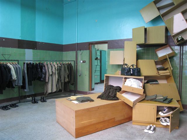
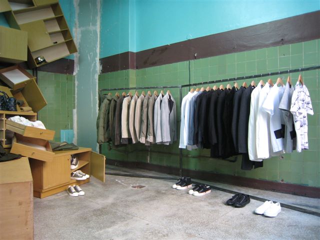
Comme des Garçons Guerrilla Store in Warsaw

gs-war-iii-12.JPG

by Orli Sharaby

Over the last few years, pop-up stores have moved from being a novelty to a phenomenon to a retail rite of passage. Now, hardly a week goes by that we don’t hear about some label or other setting up temporary shop in a shipping crate, public park, or even inside another store altogether.

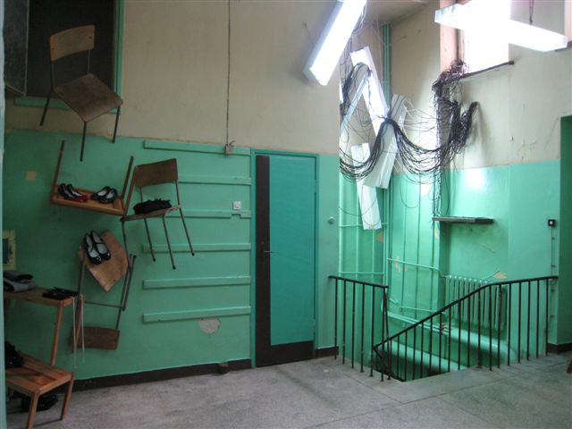
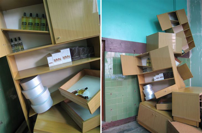
But there’s something different about the Comme des Garcons version, which has never called itself a “pop-up shop” but rather prefers the nom de guerre “guerilla store.” CDG has been operating guerrilla stores since February 2004, setting up their first shop in East Berlin, then next in Barcelona and Singapore. Guerrilla shops have also popped up in Ljubljana, Reykjavik, Athens, and other cities around the world. Each shop stays open for one year only, and advertising is limited to posters and word-of-mouth. The locations for these CDG hit-and-runs are always in gentrified neighborhoods - the new Williamsburgs or Hoxtons of the world’s emerging cities.

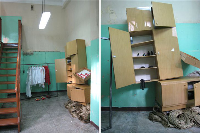
The newest Comme des Garcons guerilla store has just opened in Warsaw, in a former fruit and vegetable store in a building from the Stalinist era. This is Warsaw’s third iteration of the shop - the first, which we were fortunate enough to visit 2 years ago, was located under a bridge in an abandoned passageway.


images via HYPEBEAST
via PSFK

Behind the Scene: Seemingly Unlimited Effort for Unlimited Orange

via Creativity

Poke, London explores the endless possibilities (and massive effort) in creating the UK brand's site.

While plenty of websites can feel infinite for all the wrong reasons, Poke London's colorful online creation for UK brand Orange is in fact designed as an authentic unlimited excursion, guiding visitors on a winding rainbow through a quirky, creature/activity-filled path that can absorb plenty of eyeball time.


Inspired by Orange's tagline that "good things should never end"—which is the foundation of the mobile brand's latest promotion—the site features mischievous-looking animals/ghosts/beings buzzing about along with a host of modules for people to play with and leave a mark forever. And with a constantly evolving landscape as its main ingredient, Poke, London obviously had its work cut out from the start. "It was massive, and [technically], it was managing all that stuff so that it doesn't crash, including the way the modules were loaded in and out," Poke creative director Nick Roope explains. "We brought in [visual designer] Marius Watz and guided him about how we wanted this rainbow to grow. We brought in an illustrator, Rex, who did the little black animations. We assembled all these different people, and we had all these different elements, and there was a massive management process to bring them all together. We had to load the [elements] in and out of memory as to when they were needed because if you've been scrolling down for 20 minutes and it's a whole 20 minutes worth of different things in memory, then it would at some point crash."


By installing user interaction outlets at virtually every twist and turn, the Poke design team covered a big loading process with little loading processes which contain fun challenges. "The user would have to interact with the modules to get them to load in the first place," says Roope. "But each module has its own creative mood that presents a challenge because you have to keep people engaged while loading so the fact that they feel like they're activating these things is a [feature] and they are reacting—but the [content] isn't fully integrated necessarily straight away. Then, obviously, in order to continue scrolling on the wall, people have to close those things down so that's one way we're managing it. Then, as you're scrolling down the pages, [the system] is obviously remembering where some things are, so it's randomly dropping things in and then unlearning them as you've passed."

Poke was also pulling double duty with the audio/sound design, first enlisting the services of BAFTA award-winning composer Nick Ryan to create the chirps, hyper-electro beats, revving motors and host of other noises. Next, the group had to insert and mix the sounds while considering the spatial aspects of the site. "We [needed] to know what's both directly on the screen and what's in proximity to it so we can start to play with the sound quality—usually it was 3D sound that's [ideal] for gaming—to create some of the audio effects so that you start hearing a sound before you see something. But then, obviously, the quality of the sound changes. It's creating the impression that it's an audio landscape as well as visual."

A landscape-styled creation is what Roope and company intended during the nearly three-month process to develop Orange's site, which the creative director understandably says is "...the most expensive one-page website I think I've ever worked on." Blending puzzle games, creature interaction, and other odds-and-sods time-killers with the slightest of branding (besides a few playful links scattered about), Roope emphasizes that the site concept is in line with Orange's mantra. "The whole idea of it is to communicate the notion of 'unlimited, ultimately.' That's why the client has financed it, because it's ultimately talking about the adventure of some of their products. We've very consciously tried to build that notion in to everything that we've done, but also in a very much more poetic way."


The CD counts among his personal favorite activities on the endless adventure to be the ice cream maker (pictured). "You're invited to create an ice cream, so you rapidly generate ice cream out of different [flavors] and toppings. You can control it to a certain extent, but it's random like a slot machine. Sometimes, you get random things like cheese, but every time you create something, you can decide whether to submit it or not. When you submit, you're asked to give your creation a name. It's very mildly creative, and it's user-generated content of the most senseless input. We're asking very little of people, but we're getting a very defined stimulus that attracts a lot of people."

With the plenty to be stimulated by and the potential for users to enjoy a long stay on the site, Poke found itself challenged by creating too much or too little. "The issue that [concerned] us most was just about repetition," Roope says. "We absolutely delivered on the idea of the unlimited because no page will ever look the same. As far as content is concerned, you're at some point coming past the same things you've seen before. Some of the elements, where you're adding your own things, they're different because they're obviously generated by people as they're interacting with them. In that situation, you're always going to come across fresh content."

"But the thing that we struggled with the most was just that what would be enough. How many things do you need to give most people to make them feel like it's gone on forever without having to go on forever? It's obviously going on forever in terms of generating actual fresh, different ideas each time, but otherwise, it would be unrealistic. That was the biggest struggle, collectively. But there's no point in creating more than what's necessary, and there was also a financial limitation in there as well. It's finding the balance between the elements."