Showing posts with label Anthropology. Show all posts

Friday, July 17

“Waste Not” by Song Dong (MOMA)


An installation currently on the 2nd floor of the MOMA, unveiling the life of a typical Chinese woman through the objects she collected in her lifetime. “It is at once a record of a life, a history of a half-century of Chinese vernacular culture and a symbolic archive of impermanence.” It is mind blowing to see how much one can accumulate throughout their life if they do not dispose of the unnecessary/impermanent objects – “a time capsule of a lost era of Chinese culture.” – via NY Times

The installation is the work of Chinese artist Song Dong, in which he exposes the contents of his mother’s home acquired over 50 years, “during which the Chinese concept of wu jin qi yong, or “waste not,” was a prerequisite for survival.” Waste Not” is Dong’s first solo museum show in the U.S.


See the stop motion video of the installation coming together HERE

Tuesday, July 7

A Culture of Sharing: the HCD Toolkit by IDEO

IDEO partnered with International Development Enterprises (IDE), Heifer International, ICRW, and the Bill & Melinda Gates Foundation to create a toolkit for applying Human-Centered Design to inspire new solutions to difficult challenges within communities of need.

The Toolkit is divided into four sections:

The Introduction will give an overview of HCD and help you understand how it might be used alongside other methods.
Download the Intro Guide.pdf

The Hear guide will help your design team prepare for fieldwork and understand how to collect stories that will serve as insight and inspiration. Designing meaningful and innovative solutions that serve your customers begins with gaining deep empathy for their needs, hopes and aspirations for the future. The Hear booklet will equip the team with methodologies and tips for engaging people in their own contexts to delve beneath the surface.
Download the Hear Guide

The Field Guide and Aspirations cards are a complement to the Hear guide; these are the tools your team will take with them in order to conduct research.
Download the Field Guide
Download the Aspirations Cards

The Create guide will help your team work together in a workshop format to translate what you heard from people into frameworks, opportunities, solutions, and prototypes. During this phase, you will move from concrete to more abstract thinking in identifying themes and opportunities and back to the concrete with solutions and prototypes.
Download the Create Guide

The Deliver guide will help catapult the top ideas you have created toward implementation. The realization of solution includes rapid revenue and cost modeling, capability assessment, and implementation panning. The activities offered in this phase are meant to complement your organization's existing implementation processes and may prompt adaptations to the way solutions are typically rolled out.
Download the Deliver Guide

Also check the article by Alissa Walker (Fast Company)

Sunday, July 5

The Sputnik Observatory ( http://sptnk.org ) is a new project by Jonathan Harris

It's the result of a two-year collaboration with New York-based Sputnik, Inc., an organization that documents contemporary culture through intimate video interviews with hundreds of leading thinkers in the arts, sciences and technology, covering a wide range of topics.

The central premise of the Sputnik project is that everything is connected to everything else, and that topics and ideas that may seem fringe and even heretical to the mainstream world are in fact being investigated by leading thinkers working in fields as diverse as quantum physics, mathematics, neuroscience, biology, economics, architecture, digital art, video games, computer science and music. Sputnik is dedicated to bringing these crucial ideas from the fringes of thought out into the limelight, so that the world can begin to understand them.

Conducted over more than ten years and previously unavailable to the public, the interviews within the site chronicle some of the most provocative human ideas to have emerged in the last few decades. The site itself aims to highlight the interconnections between seemingly disparate thinkers and ideas, using a simple navigational system with no dead ends, where every thought leads to another thought, akin to swimming the stream of consciousness.

Enjoy!


Saturday, June 20


Underscoring the idea that the kitchen is both a social hub and a place of innovation and transformation,
Dornbracht, manufacturer of premium kitchen and bath faucets, has created a novel exhibit celebrating the diversity and ingenuity of actual street “kitchens.” Entitled Global Street Food, the installation includes a Vietnamese market boat laden with soft drinks and fresh vegetables, a Sudanese tea stand made from recycled tires and tin cans, and a charcuterie cart from Argentina, crafted from a shopping cart and bulletin board. It is part of the acclaimed Art Basel expo, debuting June 10, in the Vitra Design Museum in Weil am Rhein, Germany, and open to the public until July 12.

Conceived by Dornbracht’s creative and brand director Mike Meiré, the project highlights the contrast between industrial perfection and total improvisation.
By examining these widely varied displays, dismantled and shipped from their native countries and reassembled in exacting detail within the context of a pristine white space, visitors can evaluate the importance of function over form in kitchen design.

“The possibility of creating a mobile, functional unit in the smallest of spaces is fascinating,” Meiré explained. “Can we manage to create a complete kitchen in two square meters? What should it look like and how should it work? These explorations lead to new and more complex kitchen solutions. It’s about being aware of the kind of kitchen you really need for your lifestyle, and then developing the design.”

Global Street Food, which premiered at IMM Cologne furniture fair in January 2009, marks the latest cultural coup from Dornbracht and Meiré. In 2007, they offered the antidote to a high-tech, minimalist design aesthetic with The FARM Project, a walk-in kitchen stocked with live farm animals and housed in a simple barn-like structure. Intended to reconnect visitors to the source of their food and return vitality to lifeless kitchens, The FARM Project was presented at the Milan Furniture Fair in 2006, followed by coveted spots in 2007 at the Sculpture Projects Münster and Art Basel Miami. Both Global Street Food and The FARM Project are part of Dornbracht Edges, a series of projects that reflect the intersection of architecture, design and art. The Edges are platforms for designers and architects to depict their visions and utopias, with projects as diverse as they are eye-opening.
The promotion of art and culture has been an integral part of Dornbracht’s corporate culture since 1997. The company’s commitment is divided into several areas, which have developed separately and parallel since the first edition of the Statements Projects in 1997. As part of the Statements series, between 1997 and 2003, Dornbracht regularly presented free interpretations on the subject of “cleansing rituals” by internationally renowned artists, photographers, writers, musicians and designers. Since 1998 Dornbracht has addressed the general public with the Dornbracht Sponsorships, which included supporting the German project for the 48th and 49th Biennale of contemporary art in Venice. Since 2000, the exhibition series Dornbracht Installation Projects® has been based on the idea of presenting contemporary artistic positions in the field of installation. In 2005 Dornbracht launched the Performance series and transported its commitment into a new discipline: the temporary, situational character of a performance.

Further information on the Dornbracht Culture Projects on the Internet at http://www.cultureprojects.com.

Images: Dornbracht


Thursday, April 30

Social networking sites as business tools

A recent contribution by Russ Nelson of Conifer Research is worth reproducing here:

Enough adults now have profiles on social networking sites–about 35%–that the fear or ick factor is going away.

As a result, social media/web 2.0 technologies are slowly being legitimized as business tools to improve communication, collaboration, and productivity (in part by reducing the amount of email). In my mind, it’s really interesting how technology is now being developed by and for consumers and then trickles into the business world. For so many years, it was the other way around (email, computers, cell phones, etc. all began as business technologies).

putting people first

Saturday, April 11

Evolution of Office Spaces Reflects Changing Attitudes Toward Work

By Cliff Kuang

Since the dawn of the white-collar age, office designs have cycled through competing demands: openness versus privacy, interaction versus autonomy. Here's a brief history of how seating arrangements have reflected our changing attitudes toward work.

Illustration: Harry Campbell

1Taylorism (ca. 1904)

American engineer Frederick Taylor was obsessed with efficiency and oversight and is credited as one of the first people to actually design an office space. Taylor crowded workers together in a completely open environment while bosses looked on from private offices, much like on a factory floor.

2 Bürolandschaft (ca. 1960)

The German "office landscape" brought the socialist values of 1950s Europe to the workplace: Management was no longer cosseted in executive suites. Local arrangements might vary by function—side-by-side workstations for clerks or pinwheel arrangements for designers, to make chatting easier—but the layout stayed undivided.

3 Action Office (1968)

Bürolandschaft inspired Herman Miller to create a product based on the new European workplace philosophy. Action was the first modular business furniture system, with low dividers and flexible work surfaces. It's still in production today and widely used. In fact, you probably know Action by its generic, more sinister name: cubicle.

4 Cube Farm (ca. 1980)

It's the cubicle concept taken to the extreme. As the ranks of middle managers swelled, a new class of employee was created: too important for a mere desk but too junior for a window seat. Facilities managers accommodated them in the cheapest way possible, with modular walls. The sea of cubicles was born.

Virtual Office (ca. 1994)

Ad agency TBWA\Chiat\Day's LA headquarters was a Frank Gehry masterpiece. But the interior, dreamed up by the company's CEO, was a fiasco. The virtual office had no personal desks; you grabbed a laptop in the morning and scrambled to claim a seat. Productivity nose-dived, and the firm quickly became a laughingstock.

5 Networking (present)

During the past decade, furniture designers have tried to part the sea of cubicles and encourage sociability—without going nuts. Knoll, for example, created systems with movable, semi-enclosed pods and connected desks whose shape separates work areas in lieu of dividers. Most recently, Vitra unveiled furniture in which privacy is suggested if not realized. Its large tables have low dividers that cordon off personal space but won't guard personal calls.


via Wired

Tuesday, April 7

Wednesday, March 4

Museum of Design and Applied Arts Opens Packaging - Wrapping to Design


Panier de la ménagère 2009 », concept : mudac, 2009, photo : Marie Humair/Olivier Laffely.

LAUSANNE.- Packaging is a concept that goes well beyond wrapping. Even if its ultimate aim remains the protection and transport of its contents, over the course of the decades certain more subtle elements have been added to this list of specifications. Thus, one can attribute to it six main functions: to contain, transport, preserve, identify the producer, inform about the content and authenticate the origin of the product. Yet, before everything else, firms seek to put on to the market wrappings or packagings that will encourage the consumer to buy. It is this particular “design” that interests us in the exhibition staged at the mudac.

Packaging thus plays a role as a showcase, adding short-lived value to an object that makes it stand out among a plethora of stock which can sometimes be intimidating for the customer. And even if brands know that it will very often end up in the trash can once the sale has been made, they do not hesitate to change the packaging frequently in order to renew interest in a product. Incidentally, one needs to know that investing money in research into packaging is often less expensive than updating or revising the product itself.

An interesting testimony to a way of life that involves planned obsolescence and a time when change and speed are valued above all else, packaging is revealing of contemporary trends. It represents a direct consequence of industrial development and of a type of consumption that goes through numerous intermediaries: when purchases are made at the supermarket, in big quantities, and transported by car, the packaging of a product is of necessity different to one that is sold at the local grocery. We are currently witnessing a phenomenon of “over-packaging”, which runs counter to concerns about the environment. Hundreds of packagings pour into the marketplace every year and sometimes only remain on sale for a few months, since they are subject to the verdict of consumers. Analysis of these design creations is fascinating, and the mudac has for several years been observing the evolution and impact of packaging on our lives as consumers and citizens.

The exhibition is deliberately focused on two sectors that are highly dependent on the impact of packaging: food and cosmetics. This bias is dictated by practical reasons, among other factors, since these sectors have a huge volume of output and the variety of approaches guarantees the possibility of a high-quality selection. But what is most striking is that these products are for the most part in everyday use. The public’s familiarity with this type of packaging makes an in-depth analysis all the more interesting. How people look at an object, known from first glance, is different. Parallel to the products sold every day in supermarkets, the exhibition presents a choice of more luxurious objects, the packaging of which is astonishingly close to more commonplace objects.

Packaging – Wrapping to Design presents hundreds of objects, for the most part drawn from the contemporary marketplace, local or international. Multiple comparisons can be made between these objects, whether regarding their use of colour, form and typography or the use of photographs and illustrations. One products that would like to appear sophisticated: packets of coffee or tea, luxury grocery products, perfumes. Despite – or because of? – its opaqueness, black is currently synonymous with luxury. The purity of white, on the other hand, has always been associated with cosmetics, but this colour also appears in certain foodstuffs packaging. As for gold and silver, they certainly symbolise luxury and “bling” but also maturity, including in the case of cosmetic products aimed at the “mature” skin. From the perspective of form, only luxury brands can allow themselves to produce unexpected packaging in more “noble” materials. One thus finds perfume bottles with seductive curves. But this deliberate originality is also reserved for alcohol and, since a short while ago, for mineral water, sold as a rare product. Already for some time now, producers have been practising a sort of confusion of genres that is definitely worthy of attention. Certain shapes and forms traditionally reserved for foodstuffs have been assigned to cosmetics, and vice versa. This, for example, is the case with certain Body Shop creams, sold in packaging which resembles that of old-fashioned preserves in glass jars. On the contrary, olive oil and balsamic vinegar presented in the form of sprays evoke the world of hairdressing. can see, for example, that there is enormous enthusiasm for black, associated with products that would like to appear sophisticated: packets of coffee or tea, luxury grocery products, perfumes. Despite – or because of? – its opaqueness, black is currently synonymous with luxury. The purity of white, on the other hand, has always been associated with cosmetics, but this colour also appears in certain foodstuffs packaging. As for gold and silver, they certainly symbolise luxury and “bling” but also maturity, including in the case of cosmetic products aimed at the “mature” skin. From the perspective of form, only luxury brands can allow themselves to produce unexpected packaging in more “noble” materials. One thus finds perfume bottles with seductive curves. But this deliberate originality is also reserved for alcohol and, since a short while ago, for mineral water, sold as a rare product. Already for some time now, producers have been practising a sort of confusion of genres that is definitely worthy of attention. Certain shapes and forms traditionally reserved for foodstuffs have been assigned to cosmetics, and vice versa. This, for example, is the case with certain Body Shop creams, sold in packaging which resembles that of old-fashioned preserves in glass jars. On the contrary, olive oil and balsamic vinegar presented in the form of sprays evoke the world of hairdressing.

When it is necessary to economise on packaging, there’s nothing like making it attractive by devising an original graphic presentation. Whether this is done by recourse to humour (a dimension that can be observed in many British products) or by using photographs or carefully chosen illustrations, a very simple packaging can be transformed thanks to its graphic design. The Greek cosmetic products Korrès, which have won several awards for their original design, are a good example of this. Closer to hand, we must point out the intelligence of the Sélection product range sold by Migros. Their graphic design building on simple principles – gold line and white background – is able to promote elements that make their contents particularly attractive.

Another section of the exhibition traces the evolution of certain packagings, notably thanks to a batch from the design collection of the Museum für Gestaltung, Zurich, which has loaned objects from the Swiss marketplace of the 1960s to 1980s. An exceptional collaboration with the patrimony of LU [a French biscuit manufacturer] permits us to analyse a specific case, that of the packaging of the famous Petit Beurre chocolate biscuits, devised by Raymond Loewy among others.

In parallel, we present works by designers and artists who tackle the theme of packaging in their own fashion. The “Pack Sweet Pack” furniture range by the Big Game designer group hijacks the world of packaging’s standard reference systems and transforms them into furniture. As for the installation constructed from Tetrapack cartons by the graphic designers Bark of London, it develops a completely imaginary visual language and makes us aware of the impact on the observer of the graphic presentation of packaging. Finally, the “Supermarket” photographs by Frenchwoman Floriane de Lassée take into account the effect of massing with which we are all faced as we walk round a supermarket. All these deliberately off-centre observations on the theme permit the visitor to place a finger on the artificiality of packaging, while revealing to him/her the touches of inspiration offered by certain brands which have made their packaging into little treasure chests.

via Artdaily

Monday, March 2

A glimpse ahead: the Microsoft Office Labs

Microsoft just published a series of videos where they envision the future of work and life in the year 2019. From their websites, the Microsoft Office Labs:

Take a step into the future and get a glimpse into how technology may transform the way we live and work in the years ahead. Explore some of our concepts for how leading edge technologies might be used in real world settings – such as health care, manufacturing, banking and retail – over the next 5-10 years.

via The Customer Experience Labs‏

Here is the video that summarizes the different future visions.


Video: Future Vision Montage

Tuesday, January 6

Banking for the grounded consumer

icanbankit01.jpg

icanbankit02.jpg

icanbankit02.jpg

icanbankit03.jpg

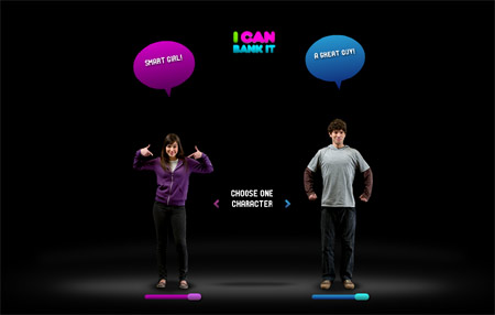
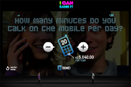
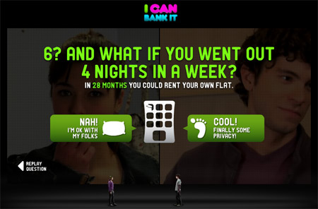
Really nice web iniative by the brazilian bank Banco Itau that taps perfectly into the grounded consumer market. You choose a character to begin with and a series of questions follow: How many minutes do you spend on your mobile every day? Do you know that reducing the costs of your calls could help you saving enough money to buy a laptop?
Long term gratifications and interesting alternatives to teach young people how to save money.

I Can Bank It created by Gringo. via adverblog

Also if you want to know more about the grounded consumer and the impact of the current economic climate on the American Dream check this really interesting report by Context

Friday, December 12

Conservative youth

According to a new survey by Synovate and Microsoft Advertising, young people resemble their grandparents far more closely than they do their parents. They seem to be more pragmatic than hedonistic and value family, good education and career.
"Young Adults Revealed: The Lives and motivations of 21st century youth" is worth the read. You can download it here

via Social Hallucinations

Sunday, December 7

The words this week: interesting read

Alan Moore's white paper on “The glittering allure of the mobile society” via London Calling


Design revolution or social (r)evolution by Marcia Caines (Cluster). Edited by Mark Vanderbeeken (Experientia) is a round up of the St Etienne Biennale and tries to answer contemporary design questions

- How can design help to develop our lifestyles?
- How to make design work with research and innovation?
- How can design now become a tool for economic development?
via Putting people first

Interesting read of the week an article about Abhilasha a pilot study by New Dehli start up Eko and the Centurion Bank of Punjab that offers an interest earning saving account that can be updated and managed through a mobile phone. In the article Jan Chipchase taps into usability and illiteracy in mobile banking. via Future Perfect

Tuesday, November 25

Just missed


S1NGLETOWN
is a Droog and KesselsKramer project.


The S1NGLETOWN paper is edited by Chris Foges and sponsored by the Ymere housing corporation, responsible for the first Droog house for singles in Amsterdam.

Participating designers includes Nacho Carbonell, Agata Jaworska, mkodama design - Mino Kodama, Marko Macura, Casulo - Sebastian Mühlhäuser & Marcel Krings, NEXT Architects
SMAQ - Andreas Quednau & Sabine Müller

Exhibition photography by Liz Hingley

S1NGLETOWN is part of ‘Out There, Architecture Beyond Building’, this year’s Venice Architecture Biennale, curated by Aaron Betsky and on view to the public from 14th September to 23rd November 2008. An accompanying newspaper features specially commissioned articles and art exploring single-living in greater depth.

Monday, November 10

Péril Jeune: The brand YOUTH @ the Musée Ethnographique de Neuchâtel

An ethnographic look at youth or being young as a brand with its stereotypes and signifiers
Great show


La jeunesse n’est qu’un mot- Photo: Alain Germond, © MEN


Révolte purifiée- Photo: Alain Germond, © MEN


Le salaire de la peur- Photo: Alain Germond, © MEN.


Comme un disque rayé- Photo: Alain Germond, © MEN


Comme un disque rayé- Photo: Alain Germond, © MEN


Péril en la demeure- Photo: Alain Germond, © MEN


L’âge d’or- Photo: Alain Germond, © MEN

Musée Ethnographique de Neuchâtel
28 juin 2008 au 1er mars 2009 - La marque jeune

via LaMJC, High Snobiety

Monday, November 3

Reading list for this week

  • A lot has been written recently about Design Thinking, innovation and branding. This article by Todd Wasserman in Branweek looks at successful example of design thinking in marketing campaign. The future of branding is in design.

  • As seen in NYT, Vogue Teen shop is landing in the Mall at Short Hills in New Jersey, the pop up store aptly name Haute Spot will not be selling anything but allow girls to relax, have a smoothie and try on clothes. “We’re not actually selling products, because our goal is to encourage people to shop in the mall,” Ms. McEwen said. More than 20 Teen Vogue advertisers are participating, including Clinique, Armani Exchange and Aldo.


Sunday, September 7

StoREtail

I have been reading a lot about storytelling and the retail environment lately. Here are two interesting examples I came accross this week.

Idris Mootee puts it really well in a recent post:

Real-life customer stories will fuel the re-invention of marketing, all brands in the future will exist between the intersection of a value system and stories around them. Expect that in 3 years the competition of noises and images will evolve into a stage which I call stories war. Every brand will fight not to own a positioning (that’s so old school advertising) but to own stories. The next competitive front for brands would be to own the “best stories” and most relevant "key words” for search. Who cares about tag lines and slogans. Most of them don’t mean anything anyway.

then David Polinchock

In this digital age, when information is alway's available online, while walking around places, I can never find the information about what I'm looking at. I'm not talking about directions, but the stories of the places I'm looking at. And not just the tourist story, I want to know more stories, the personal stories from peolple with experience. That's why people like tour guides. Good ones can tell us the inside story and give us a peek behind the curtain.


via FutureLab

Friday, August 22

ESOMAR 2008/ Montreal 22-25 September

If you have a moment listen to this really interesting preCast, looking at cultural and sociological methods and how they impact brand strategy and innovation.
via ESOMAR


"I think all the research industry should adopt a CFO, because what the CFO wants to know is not whether this ad tested better than that ad, but does the whole program move us ahead in making brands more valuable in peoples' lives and therefore impacting the bottom line." (Alan C. Middleton).

In this preCast, ahead of this year's Congress in Montreal, BrainJuicer Chief Juicer John Kearon chats with three of the Congress keynotes about how cultural and technological changes are impacting peoples' lives, and how the disciplines of marketing, branding and research need to adapt.

Joining John is former senior JWT executive Alan Middleton, popular anthropologist Grant McCracken, and design entrepreneur Richard Eisermann.

LISTEN TO THE PODCAST HERE


STARRING...

Alan C. Middleton
Assistant Prof. of Marketing and Executive Director,
Executive Education Centre, Schulich School of Business,
York University
(http://www.schulich.yorku.ca)
Grant McCracken
Anthropologist, Research Affiliate, MIT
(http://www.cultureby.com)
Richard Eisermann
Co-founder, Prospect
(http://www.prospectdesign.eu)
Host: John Kearon
Chief Juicer, BrainJuicer
(http://www.brainjuicer.com)