Tuesday, March 25

Design Miami/ Teams Up with New York Galleries

design miami new york dd.jpg

If you're happened to be in the area, don't miss it. Design Miami does NY.

The Armory Show and a mushrooming crop of satellite art fairs kick off on Thursday, and this year, Design Miami/ decided to make sure that design wasn't lost in the shuffle. The slash-loving global design forum is collaborating with 11 New York design galleries to promote exhibitions of limited-edition contemporary and rare historical design in their gallery spaces throughout the city. "While collectors and design enthusiasts were able to visit temporary booths organized by each of these galleries at Design Miami/, this event will allow each gallery to emphasize its own unique sensibility, on its home turf," said Design Miami/ director and co-founder Ambra Medda, who adds that she hopes that the New York event might inspire visitors to make it down to Miami this December.

The exhibitions will be on view starting tomorrow and through Thursday from 11am to 6pm. Among the shows is "In Their Own Words" at Demisch Danant (pictured above), which captions art and design objects with the comments of their creators, and a couple of blocks south is Sebastian+Barquet's "Formes et Couleurs," featuring the work of such monumental designers as Charlotte Perriand and Jean Prouve. After the jump, we've posted a full list of the participating galleries and their exhibitions. And the highly ambitious should consider adding two additional stops to their Gotham design tour: both Christie's and Sotheby's have 20th-century design sales this week that are now open for viewing.


Design Miami/ New York Galleries * March 25-27

Antik (104 Franklin Street) marks the gallery's tenth anniversary in TriBeCa with "Stengods:" Scandinavian Stoneware in the 20th Century, an exhibition celebrating its enduring inspiration--studio ceramics. This installation represents the finest achievements of master artisans from Sweden, Denmark, and Finland, including Berndt Friberg, Axel Salto, Carl Harry Stalhane, and Birger Kaipiainen.

Christina Grajales Inc. (10 Greene Street) presents new acquisitions and highlights from the collection, including a special installation of lighting by Christophe Come and an exhibition of hand woven textiles by Hechizoo.

DeLorenzo 1950 (440 Lafayette Street) offers METAL & WOOD, an exhibition of 20th century American woodworkers, including George Nakashima, Phillip Lloyd Powell, and Wharton Esherick, alongside work by French metal designers Yonkel Lebovici and Serge Mouille.

Demisch Danant (542 West 22nd Street) presents In Their Own Words, an exhibition of photography, sculpture, furniture, and architecture created within, and often in reaction to, various socio-political moments of the 20th century. Captions written by the artists reveal each work's original impetus and intent.

Donzella 20th Century Gallery (17 White Street) hosts an installation of important and unusual lighting of the 20th and 21st centuries, exploring innovations in form, style, and materials that span over 50 years. The exhibition features Italian and American pieces by Fontana Arte, Paul Laszlo, Arredoluce, and Carlo Nason for Mazzega, as well as custom design works by contemporary French artist Alexander Loge.

Galerie Patrick Seguin (at Sonnabend Gallery, 536 West 22nd Street), with Galerie Jacques Lacoste, curates the first important retrospective exhibition on the oeuvre of Jean Royere (1902-1981). The exhibition includes some 100 pieces (furniture and lighting) that retrace the career of one of the most innovative decorators of the 20th century.

Johnson Trading Gallery (490 Greenwich Street presents Mario Dal Fabbro, 1913-1990: A Retrospective. The exhibition offers insight into sculptor/designer/illustrator/author Del Fabbro through extraordinary examples of his woodworking talents and profusion of publications.

Magen H. Gallery (80 East 11th Street) features Beyond Decorative: The Marriage of Artistic Vision and Furniture, an exhibition of recent sculptural furniture marked by a mastery over the medium and a shared concern for the aesthetic potential of the decorative arts.

Moss (150 Greene Street) offers Dutch Masters, a tightly curated selection of design objects in metal, textiles, and wood from celebrated Dutch designers Marten Baas, Hella Jongerius and Studio Job.

R20th Century (82 Franklin Street) represents an international and distinguished group of vintage and contemporary designers whose work is among the most important, innovative and finely crafted of their time. Masterworks from Joaquim Tenreiro, Sergio Rodrigues, Poul Kjaerholm, Jose Zanine, Wendell Castle, Jeff Zimmerman and Paula Hayes will be on view.

Sebastian+Barquet (544 West 24th Street) announces Formes et Couleurs, an exhibition showcasing monumental designers who have left an indelible mark on the design landscape, including Charlotte Perriand, Jean Prouve, Serge Mouille, Jean Royere and Xavier Mategot.

via MediaBistro

Monday, March 24

Inspired by

I wrote about Trisword last February, it seems the designers have been inspired by Mikado Table (2004, Cecilie Manz)
Here is a picture


Thanks anonymous

Sunday, March 23

OVOPUR

aquaovo_ovopur_water.jpg

aquaovo's OVOPUR is the environmentally friendly water dispenser. So much so that 1) it doesn't consume any electricity, using gravity instead to filter and revitalize tapwater, 2) the unit itself is made of porcelain, glass, and metal, and 3) it features a reusable, multilayer filter cartridge whose contents are 100% recyclable. The main reservoir can hold up to 11 liters of fresh water, with the water level indicated by the magnetic gauge. The filter cartridge uses a combination of KDF 55, activated carbon, microporous bioceramics and quartz crystal to remove impurities from the water.

+ aquaovo.com

aquaovo_ovopur_system.jpg


aquaovo_ovopur_system2.jpg
Close up of spout.


aquaovo_ovopur_filter.jpg
Recyclable filter.

via MoCo Loco


Magic Mirror Mobile Phone by Timofej Gorlov

Check out this Magic Mirror concept phone which has all its electronics concealed inside a glass sphere with two displays. The image on the displays comes from internal electronics or delivered from the six internal cameras. The screen can also be made to produce a magnifying glass effect.

Magic Mirror Mobile Phone by Timofej Gorlov

The device can even read your lip movements and recognize your verbal commands, thanks to the cameras and internal electronics. Animated realistic changes between chronometer, magnifying glass, mirror, compass, news box, phone, media player, TV make for some kinda magical effect. At the base of the device is a glass frame that allows limiting access to control and to superfluous perusal of object. This creates illusion of additional movement in internal space on displays.

Magic Mirror Mobile Phone by Timofej Gorlov

Numeralization allows creating totally individual interface yourself by means of computer via Bluetooth. Let’s quote an example. The change to the mode of operation ‘ON’ is dark background, the point of light at the center of opening aperture and you can see the whole indicator panel of chronometer. Moreover, even the small shadow gets a move on with second hand.

via Gadgettastic

Via Bornrich

Girly high tech or la vie en rose

'Feminocracy' is on people lips, see Design Week (Feb 2008)
Let's follow the trend


finepixz20 fuji Fine Pix by Fuji

motorola u9 femmeU9 Motorola

chaise longue clavier pink mouse by La chaise Longue

Le chauffe mug de Brando USB Coffee warmer by Brando

nintendo ds lite femme DS Lite by Nintendo

cleusblachaiselongueUSB by La chaise Longue

ipode nano rose Ipod Nano by Apple
parfum mageekstore Perfume and USB by Mageekstore

ordinateur vaio rouge Viao by Sony

hp pda Ipack 100 by HP

21st Century girl
Le journal des femmes

Thursday, March 20

Smart Car’s ‘Sideways’ Art Project

by Abigail Doan

Smart Car, Smart Car USA, Smart Car Sideways, Sideways: A Smart Art Project, Smart Car book project, Smart Car art project, Smart Car environmental art, Smart Car eco-art

It’s official that the eco-chic Smart Car is coming to the USA in 2008, and to add to this momentum, Smart is releasing a gorgeous creative anthology, “Sideways: A Smart Art Project”, as a means to highlight’s Smart’s goals of greening urban transportation and our contemporary motoring lifestyle. The project combines the diverse work of 100 international contributors in collaboration with 11 leading international magazines. The eco-based submissions have been cultivated from the fields of photography, illustration, graphic design, painting, sculpture, architecture, and fashion. “Sideways: A Smart Art Project” is definitely moving us forward with 240 pages of modern ideas about creative inroads for our environmental roadmap as well as progressive transportation alternatives.

Smart Car, Smart Car USA, Smart Car Sideways, Sideways: A Smart Art Project, Smart Car book project, Smart Car art project, Smart Car environmental art, Smart Car eco-art

An “aesthetic approach to environmental issues” might not be the most urgent way to tackle some of the most pressing issues out there, but we cannot overlook Smart’s track record to date and their history of being an auto manufacturer with low CO2 emission standards. The Sideways project will be accompanied by an international marketing campaign that will seek to “underline Smart’s view that it is possible to act ecologically without remotely neglecting aesthetic design concerns.” Smart’s Head of Marketing and Sales, Anders Sundt Jensen, has commented, “Sideways looks at the issue of ecology in a new creative context, and it should therefore generate some interesting new takes on the topic.”

Artists involved in the project include: Terence Koh, Steven Klein, Ari Marcopoulos, Hanna Liden, Ataleier Van Lieshout, Marjetica Potrc, Rikrit Tiravanija, and Benjamin Alexander Huseby, to name a few. Lot-ek has created the environmental design installation for the book’s official launch here in NYC on March 19.

“Sideways: A Smart Art Project” was produced by Die Gestalten Verlag, a Berlin publishing house in conjunction with Smart. Sideways will be available beginning April 1, 2008 in the international book trade, at museum and concept stores, and online at Amazon.com.

+ Smart USA
+ ‘Smart Car is Coming to the US in 2008′ on Inhabitat (December 2007)

Smart Car, Smart Car USA, Smart Car Sideways, Sideways: A Smart Art Project, Smart Car book project, Smart Car art project, Smart Car environmental art, Smart Car eco-art

Smart Car, Smart Car USA, Smart Car Sideways, Sideways: A Smart Art Project, Smart Car book project, Smart Car art project, Smart Car environmental art, Smart Car eco-art

Smart Car, Smart Car USA, Smart Car Sideways, Sideways: A Smart Art Project, Smart Car book project, Smart Car art project, Smart Car environmental art, Smart Car eco-art

Smart Car, Smart Car USA, Smart Car Sideways, Sideways: A Smart Art Project, Smart Car book project, Smart Car art project, Smart Car environmental art, Smart Car eco-art

Smart Car, Smart Car USA, Smart Car Sideways, Sideways: A Smart Art Project, Smart Car book project, Smart Car art project, Smart Car environmental art, Smart Car eco-art

Smart Car, Smart Car USA, Smart Car Sideways, Sideways: A Smart Art Project, Smart Car book project, Smart Car art project, Smart Car environmental art, Smart Car eco-art

via inhabitat

Saturday, March 15

Pantone crazy

sartorialist-color-palettes.jpg

A Swiss graphic design student has spent a rather lot of time analyzing the color palettes of 1500 photos from the Sartorialist and published it all blog style. He wrote to us and said:

You surely know the sartorialist blog, well some months ago I started creating colour palettes extrapolated from his photos I thought had nice combinations. Then, I realized that it's difficult to find some sort of database of clothing colors, so I decided to create it. After three month of copying, seeing, pasting, matching here I am, a bit insane but with about 1500 palettes and the relative photos.

What's nice is that he's categorized by different colors such as aqua, gold and purple - and then, on further analysis, you begin to work out what are Scott Schuman's favorite colors: blue, white and brown appear in a third of the photos and grey is in just less than half! Or it could just be the fashion... Wear Palettes

via psfk

Friday, March 14

Deadly Knife adds more pain by injecting compressed air into the wound

Taking No Country for Old Men too literally

A patent has been filed by inventor Gregory Rondinone of Connecticut for a knife that will shoot a jet of compressed air into whatever it punctures at the press of a trigger. The concentrated burst would be powerful enough to rupture soft tissue in organs, not to mention pump a ton of air (or some other gas) deep into places it shouldn’t be. It’s been suggested that the knife has valuable applications for underwater use, such as a diver staving off a large animal, both injuring the offending creature and rendering it unnaturally buoyant so that it floats away.

Gregory Rondinone

(more…)

Post from: gadgettastic.com

Deadly Knife adds more pain by injecting compressed air

Weird Science

Object Lesson

ITSNONAME experiments with a new formula in modern jewelry. By Danielle Prescod


periodictableringsinstory.jpg

From the ancient Greeks to Animal House, the classic insignia ring has long been a proud symbol of clans and lineage worldwide. This commemorative bling makes a great hand-me-down for those who love the classics, but for the modernist at heart, the new line ITSNONAME has an appealing offering at hand—the Periodic ring, a symbolic description of nothing but itself.

Co-designers and couple Joe Johnson and Jeanju Choi-Johnson had a refreshingly unfussy approach to creating the line. "The concept was simple," Johnson says. "It's just a blatant presentation of the natural material the jewelry is composed of." Using the periodic table as the foundation, each ring in solid silver, gold, or platinum is inscribed with each element's actual periodic table data and made complete with both scientific symbol and atomic number. By providing us with a chemistry cheat-sheet, the Periodic ring might actually be the most conspicuous form of wearable art we've spotted in a while. As both designers put it, "[These] rings are the solid truth, literally."

As luck would have it, the duo met at a house party in Minneapolis—not science class—and they currently occupy a studio in Brooklyn. But designing isn't (yet) their full-time day jobs. "We both also work 9 to 5 jobs for advertising and fashion companies," Johnson says. "Jean worked in fine jewelry for a couple of years where she learned the technical ropes. And one night, the idea just hit us." Since the recent debut of the collection, the designers have already been taking orders, and the pair plan to build a full line of pieces to add to the rings in the near future—designs that will more than likely also be worth their weight in Au.

ITSNONAME Periodic rings, from $205 for silver to $6,500 for platinum, are available online at itsno.name and by email, info@itsno.name.


via refinery29

Thursday, March 13

Bling Phone

The image “http://www.newsluxe.com/Image/minox_appareil_photo_gold.jpg” cannot be displayed, because it contains errors.

$2400
24 carats gold phone encrusted with 10 diamonds (0.03 carats each)

Friday, March 7

Mole Architects resurrects Cambridge University’s department of architecture

The new extension sits opposite the 1958 building by Colin St John Wilson and Alex Hardy.


By James R Payne

Mole Architects, working with Freeland Rees Roberts, has designed a sustainable extension to Cambridge’s architecture faculty

The architecture school at Cambridge has always had an influence disproportionate to its modest size. Existing in embryonic form since Edwardian times and based since 1924 at Scroope Terrace, until the recently completed programme of renovation, with an extension by Mole Architects with Freeland Rees Roberts, it had been extended only once in almost 100 years.

The first extension was built soon after the appointment of Leslie Martin as the first chair of architecture in 1956, marking the start of the modern era of architectural education, not just in Cambridge but for Britain as a whole.

Less that four years ago, Cambridge’s department of architecture was threatened with closure, provoking a vigorous campaign attracting high profile support and publicity, not least from its many famous alumni. The school survived but its highly respected graduate programme did not, stripping the school of its diploma and ability to send RIBA part II-accredited students out into the world of practice.

Essentially, it was the victim of a combination of government funding policy, which awards funds on the basis of research points, and Cambridge University’s ambivalence towards the status of architecture as an academic subject. The department’s funding crisis has led to a radical restructuring in every way.

Head of school Marcial Echenique is in a relaxed mood as he shows me around the extension. The new sawtooth-roofed eco-studio building for undergraduates has been complete for some months, and research staff have just moved from the old Martin Centre a mile away to refurbished offices in the 1830s Victorian terrace rooms which were previously occupied by students. With the future secured, he has plans to step down as head of school, having been involved with the department, particularly on the research side, since the sixties.

Part of the deal struck with the university to unite research and studio teaching was the sale of a valuable Victorian villa that had housed the Martin research centre, formerly the Centre for Land Use and Built Form Studies, set up in 1967.

Arguably, the £3 million project is not an expansion, more a consolidation on one site. With its important academic links with the adjacent engineering department and a tradition of one-to-one tuition, relocation or significant expansion of student numbers was not seen as an option.

Echenique explains that he had a sketch design for the new building but the university wanted to employ an outside architect for contractual reasons. Mole Architects, a young practice known for its impeccably sustainable Fenland houses, was approached to design the new studio building in the garden. Cambridge architect Freeland Rees Roberts worked with Mole and was entrusted with renovating the terrace.

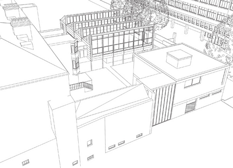
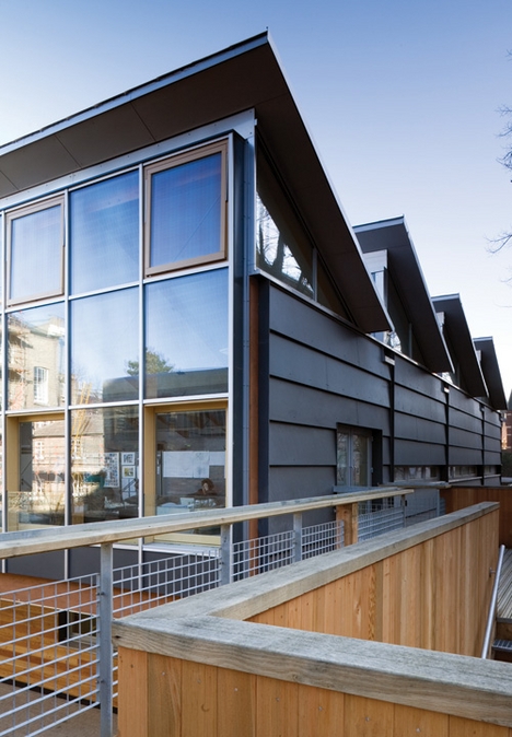
Built for around £1 million with impressive speed, the elevated volume of the studio space is set away from the rear of the terrace and overhangs a blockwork workshop at garden level and a large faculty parking area to the south. It is raised up on laminated timber columns and beams, and links to the raised ground floor of the Victorian building with a timber-framed bridge clad in zinc. Similar to an internal air link, it ramps up gently to dock with the new building.

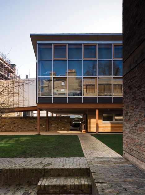
Emerging through double-glazed doors into the columnless space, a wall of glazing on the right looks north across the garden and faces on to the brick golden section of Colin St John Wilson and Alex Hardy’s 1958 extension.

Both are what the Japanese would call “flagpole” buildings, the main accommodation accessed from long, narrow connecting pieces which negotiate changes in level. In the older building, this is done with half-level stairs. To provide level disabled access between studio and lecture hall, an external timber bridge structure now encloses the garden to the west.

This rather provisional-looking solution avoids the deployment of an impossible number of stair lifts, but the perfect enclosed profile of the older building seems to reject the advances of the new one’s wooden arm.

Once climbing plants have been persuaded to grow on the steel mesh balustrade, this should be less of an issue. A continuous circuit at first floor level with an external stair down to a kind of cloister promises to contribute to a pleasant working environment in the summer.

“To provide disabled access, an external timber bridge structure encloses the garden”


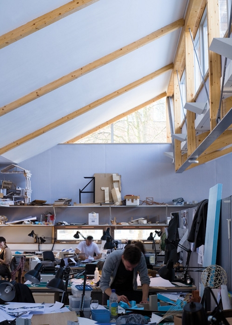
The four-bay timber and steel-trussed structure spans 15m, the structural diagram exaggerated with thinner steel chords and bracing acting in tension. The planes of the sawtooth roof, tilted to receive north light, rest on timber rafters. The sides of the roof lights are glazed and provide high level views to the terrace and the trees in front of the engineering block to the west.

Echenique’s own 1974 house in Cambridge provided the model of a lightweight timber architecture somewhat akin to the Segal method. To make the new building both lightweight and a case study in sustainable design, an innovative system of water pipes set into panels in the roof is linked to underground bore holes. These provide water to stabilise the temperature, cooling in the summer and heating in the winter. This system, together with a series of high level manually switched opening windows, should ensure a comfortable environment with little external input of energy.

Work to the terrace has focused on updating services, installing a new lift and regularising circulation around central spine corridors. The excellent library, shared with the art history department, has also been extended in the basement to incorporate some of the research department’s volumes. Services have been carefully concealed throughout, most successfully with natural ventilation ducts in the chimneys, which means the front sash windows do not have to be opened to the road.

Elegant fuschia

Grand rooms on the first floor have been painted with rich colours, and all cornices, window shutters and joinery have been restored to their original glory. The elegant fuschia-pink boardroom has a huge flat screen on one wall; unfortunately, the effect is spoilt by some rather tricksy lights over the conference table.

Elsewhere, sympathetic restoration of the rooms is undermined by use of strip lighting and plastic conduit from the world of the cheap office fit-out. Plywood screens with glazed upper panels are used as devices to partition off smaller offices within larger rooms at the rear along the central spine corridor. These devices cleverly conceal horizontal service runs but sit uneasily against the fine joinery and detailing of the Victorian terrace. The glazed panels are intended to offer an uninterrupted perception of the colour fields of the larger rooms but meet ceiling and cornice rather awkwardly.

For students — presuming it is these who the architecture department is for — the school needs an area where they can meet and exchange ideas, where individual or group work can be carried out, and a representative place for exhibitions and lectures. The 1958 extension has been carrying out the latter functions for 50 years, and does not look the worse for wear. If anything, it now forms the permanent backdrop to the department as the character of most of the terrace and garden has been altered.

Seen from outside, Wilson’s building seems bloody-minded and inscrutable, with its expressed concrete slab and brick wall. Like many buildings in Cambridge from this era, its bespoke modernism of rich materiality and spatial complexity has to be appreciated from inside. The spaces are introverted and, perhaps fortunately, you can’t see the new building in the crit space or lecture hall.

The new studio does not speak the language of permanence, nor indeed does it give the suggestion of utopia that temporary architecture can offer. The lightweight materialisation of the new building forms an interesting counterpoint to the heavy tectonics of the brick box but in this context needs to offer much more than just a neat structural and environmental diagram. Little thought seems to have gone into the use of the room beyond creating a large, shed-like space.

Curiously old-fashioned

This is not just a flexible area that students can do what they want with, but a regimented arrangement of desks and low partitions with some 120 undergraduates packed in. The studio has the feel of a call centre in an agricultural building, the envy of any Fenland gangmaster, or perhaps a curiously old-fashioned architect’s workroom, where technicians of the past would have slaved over drawing boards in white overalls. Except for flimsy office partitions, there are no walls to pin up drawings, while wall-mounted shelves have quickly accumulated assorted models and junk.

It is perhaps the fate of almost all architecture departments to burst at the seams, and a rethink of the interior fit-out could certainly improve matters. The innovative approach of the building to sustainability is laudable, and it boldly sets out the new direction of the school, but you can’t help but wonder that something is missing.

project team

-

Client University of Cambridge, Architect Mole Architects with Freeland Rees Roberts Architects, Engineer Scott Wilson, Quantity surveyor Gardiner & Theobold, Mechanical and electrical Max Fordham, Project manager Hannah Reed, Main contractor ISG Dean & Bowes

specifications

- Glulam frame Constructional Timber, Stainless steel roof Ugitop, Gutter lining Alwitra Evalastic, Breather membrane Proctor, Windows Rationel, External cladding Eternit Natura, Insulation Isowool, Radiant heating Variotherm, Linings Fermacell, Lighting Erco Parscoop, Curtain wall Seufert Niklaus

Original print headline: Cambridge resurrection


ground floor plan


1st floor plan


Section


Looking from the bridge link between the new building and the earlier extension.

A ramped link connects the new building back to the terrace.


via BD the Architects' website

Maison Tropicale/Jean Prouvé


One of the three examples made of Jean Prouvé’s Maison Tropicale has been moved from France and set up outside the Tate Modern where it will be on show until April 13.

Recently restored, the house was found in a poor state of repair in 2000 at Brazzaville in the Republic of the Congo. It was then taken to France for restoration. The design, which represents an important part of Prouvé’s work on prefabrication, dates back to 1959 when the French government commissioned a study for an economical and transportable building unit (for housing and civil buildings) to be used in the West African colonies.

The designer responded with a house made from foldable sheets of aluminium and steel that was easy to dismantle and store in a cargo aeroplane. In relation to climatic characteristics, the small building has a veranda with a moveable sunscreen, internal walls made from sliding metal panels and round holes filled with coloured glass to filter UV rays, and a double-layered roof to provide natural ventilation. Unfortunately, the goal of mass production was never achieved and it now remains as a threedimensional icon of an architectural utopia. S.M.

via Domus

http://www.designmuseum.org/

Herzog and de Meuron

40-bond-gate1.jpg

Herzog and de Meuron designed 40 Bond, a luxury residential project… Let’s forget about the expensive residences and comment on the incredible aluminum gate at street level.

With a graffiti-inspired form that twists and turns, the gate measures 55 meters high by 355 meters long… I just love it! Great design for everyone.

40-bond-gate2.jpg

40-bond-gate3.jpg

via CoolBoom

Photos by Iwan Baan

130707 Jardín vertical

CaixaForum Madrid

Madrid gets a new contemporary art museum—complete with vertical garden of 15,000 plants

Swiss architects Herzog & de Meuron have converted a former power station for the Caixa Foundation

The CaixaForum

The CaixaForum

MADRID. Madrid’s latest art museum, the CaixaForum, has opened in the heart of the city’s cultural district near the Prado, the Reina Sofia and the Thyssen-Bornemisza museums. The $94m project has been funded by the Caixa Foundation, the philanthropic arm of the Spanish bank, Caixa d’Estalvisi Pensions de Barcelona.

Designed by Swiss architects Herzog & de Meuron, the museum is housed in a converted 1899 power station. The building—one of the city’s few remaining examples of historically significant industrial architecture—was acquired by the foundation in 2001.

The 19th-century brick walls have been retained, but raised on piers so that visitors can walk underneath the building. There are two underground floors, while a two-floor attic storey of rusted iron surmounts the original building. The conversion has increased the floorspace five-fold—from 2,000 sq. m to 10,000 sq. m.

“The fact that its heavy mass is detached from the ground in apparent defiance of the laws of gravity is not a magic thing, given the possibilities of 21st-century technology,” says architect Jacques Herzog, “but a need to explore the limits of freedom. The CaixaForum has been conceived as an urban magnet, attracting not only art-lovers but all the people of Madrid and those from outside the city. We wanted to surprise. A building must be like a new outfit of clothes for the city—always a bit sexy.”

As striking as the architectural conversion is the 460 sq. m, 24-metre high vertical garden that takes up one wall of the square in front of the building. Comprising 15,000 plants of 250 different species, it has being designed by botanist Patrick Blanc.

“The garden is a dialogue with the Botanical Garden on the street and adjacent to the Prado,” says Herzog. “We love to make new things, to experiment with materials and create a very unusual encounter between the rough and the natural, the smooth and the artificial, to incorporate nature so there can be the smell of a garden where you would not expect it.”

The new museum will have a wide brief, hosting touring exhibitions as well as festivals of music and poetry, debates and education programmes. One of its main functions will be to show selections from the Caixa Foundation’s collection of more than 700 works, mainly dating from the 1980s to today. The opening show includes 37 works by contemporary artists such as Cindy Sherman, Cornelia Parker, Richard Long, Anselm Kiefer and Georg Baselitz (until 6 April).

“The Caixa Foundation pioneered collecting and showing the most avant-garde contemporary art in the 1980s,” says Jose F. Coronado, general director of the foundation. “Our philosophy was to use culture as a tool for social integration. We wanted to break the barriers that separate many people from art, music and the humanities.”

The gallery’s next exhibition will be “The Bread of the Angels”, with 45 paintings on loan from the Uffizi Gallery in Florence. Many of the works, including paintings by Botticelli, Luca Giordano and Parmigianino, have never before left Italy.
via Artnewspaper

Thursday, March 6

Death Star Lunar Hotel in Baku, Azerbaijan

by Cate Trotter

Azerbajan Death Star, Heerim Architects, Baku Death-Star, Death-star, Deathstar, Death Star, Star wars inspired, Hotel Full Moon, Full Moon Bay, Hotel Crescent, green development, green city, middle eastern green development, lunar architecture, Heerim Architects

Why wonder if we’ll ever live on the moon when it’s being built right here on Earth? Heerim Architects are planning to bring Star Wars chic to the Azerbaijani capital of Baku, defining the look with two uber-futuristic buildings to act as markers of the gateway of one of the world’s fastest growing economies.


Azerbajan, Death Star, Heerim Architects, Baku, Hotel Full Moon, Full Moon Bay, Hotel Crescent, green development, green city, middle eastern green development, lunar architecture, Heerim Architects

Facing the Caspian Sea, the buildings are named Hotel Full Moon - a disc with rounded edges and a hole in one of the top corners - and Hotel Crescent, a curving arch similar to a crescent moon – and will mark out an area appropriately named Full Moon Bay. Designed to appear drastically different from different viewing angles – from one angle Death Star and from the other Gherkin - Hotel Full Moon will be a 150 meter-high, 35 story luxury hotel with 382 large rooms.

Hotel Crescent is designed as a counterpoint to Hotel Full Moon, with its column supports being disguised by its arched façade. The two hotels will be joined by three tall residential buildings and a fourth 43 floor office building standing 203 meters tall. If Full Moon Bay can just shake off the ‘Death Star’ vibe, it’s looking to be an amazing development.

Via Treehugger via Skyscraper News)

Azerbajan Death Star, Heerim Architects, Baku Death-Star, Death-star, Deathstar, Death Star, Star wars inspired, Hotel Full Moon, Full Moon Bay, Hotel Crescent, green development, green city, middle eastern green development, lunar architecture, Heerim Architects

Azerbajan Death Star, Heerim Architects, Baku Death-Star, Death-star, Deathstar, Death Star, Star wars inspired, Hotel Full Moon, Full Moon Bay, Hotel Crescent, green development, green city, middle eastern green development, lunar architecture, Heerim Architects

Azerbajan Death Star, Heerim Architects, Baku Death-Star, Death-star, Deathstar, Death Star, Star wars inspired, Hotel Full Moon, Full Moon Bay, Hotel Crescent, green development, green city, middle eastern green development, lunar architecture, Heerim Architects

via inhabitat