Monday, November 19

Creative Industry Work Units


Allard Architecture's Matchbox design in the developing area of Amsterdam North

Matchbox is a 30+ unit commercial building with 4500m2 leaseable space for small to mid-sized companies within the creative industries. The site is located in a developing area in Amsterdam North, and will be realized as the third phase of development in this area. The new building will connect to and share facilities with its neighbour to the north. Conceived of as pre-fabricated units that are stacked one on top of the other, thus creating visibly unique spaces. The central garden atrium that is carved out by the positioning of these units allows for street side cantilever’s and stepped facades. After graduation, Allard Meine Jansen (b.1970) worked first for Herman Hertzberger, Renzo Piano, Massimiliano Fuksas and De Architekten Cie., before setting up his own practice in 2006. His first built work was the conversion of a former boxing school in Amsterdam into his own home office. Since then he has worked on several studies for property developers. Now he has his first new-build commission, a multi-occupancy building in Amsterdam North. The design entitled ‘Matchbox’, is a stacking of commercial units that are rotated and shifted with respect to one another – a strategy designed to liberate them from their claustrophobic situation between two bigger buildings and to underscore the individuality of the users.


via WAN

Friday, November 9

The Volkswagen Drive In

From The Netherlands, a uber cool site to celebrate Volkswagen's 60th anniversary in the country and challenge your music knowledge. Everything it's in Dutch, but don't panic, just wait for the site to load, and then click on "speel het spel" to start playing...

volkswagendrivein01.jpg

You have to match every song with the decade it belongs to... I did 11 at the first attempt, and you?

As Dick explained me, the site it's the recognition of the typical songs that revitalises the rich Volkswagen history, but above all, it is much fun to play and guess whether Bill Haley was popular during the Fifties when the Volkswagen Beetle was introduced or during the Sixties when Volkswagen revealed its first mini Van.

volkswagendrivein02.jpg

Congrats to Achtung! for the great work. My only doubt it's why they called the site Volkswagen Drive In and not Volkswagen Juke Box...


via Adverblog

Google Map Live

Google is planning a partnership today with Gilbarco Veeder-Root to include Google’s mapping service on 3,500 Internet enabled gasoline pumps across the US. The maps will accessible via each gas pump’s small screen giving motorists the ability to scroll through local landmarks, hotels, restaurants, and hospitals. The pump will also be able to print directions.

News
[via Google gas pumps: the savior of lost men - Engadget]/PSFK

Thursday, November 8

Visionaire/MINI collaboration

Visionaire/MINI collaboration

There is nothing we find more pulse raising than when great minds converge to create specially crafted masterpieces. So imagine our excitement upon hearing that Visionaire and MINI have come together to harness the genius of aficionados from the design and music world for their collection of limited edition vinyl records.

With musicians such as U2 and Courtney Love providing the sounds, and the likes of Karl Largerfeld and Alexander McQueen supplying the visuals, the collectable box-sets have been launched in time with the new and unique ‘shooting brake’ concept, for our already much lauded MINI Clubman.

Since 1991 Visionaire has been making its mark within the exclusive-loving fray with their collaborative albums that have thus far offered a forum for both famous and emerging artists.

This issue entitled ‘Sound’ is set to be another sought-after success. The 4,000 limited edition cases contain five vinyls, imprinted with customised images and 100 minutes of audio, from unreleased songs to spoken word recordings.

In this age of sleek digital sound systems, vinyl record players have become a dying breed. However, to combat most people’s inability to throw on a 12-inch, the records come complete with their very own player in the form of a dinky battery-powered MINI Clubman with speakers and a needle.

As the car drives around the record, it acts as a portable sound system, although we feel maybe not conducive to a bumpy car ride. However, for those who wish to listen on the move, the set will also contain CDs with all the sound content.

via Wallpaper

CrowdSourcing Product Improvements

via SpringWise


It's a rare product that can't benefit from at least a little bit of improvement, and many leave room for lots more than that. RedesignMe is a Dutch site that is putting crowdsourcing to work to refine and revise product designs of mass-produced consumer goods.

Consumers frustrated by mobile phones, coffee machines, or products of virtually any type can submit a photo or video of the product along with a description of what they think needs redesigning. One user, for example, complains about excessively sensitive buttons on his cell phone that frequently get pressed by accident; another describes an alarm clock that won't go off. Other users on the site can then submit suggestions for redesigning the product in question, with the option of using an online design tool to annotate pictures with post-it notes, text balloons and arrows. Users can rate each other's submissions and add comments, and prizes are awarded each month.

After a beta period beginning in late July, RedesignMe just officially launched a few weeks ago, with the goal of "promoting simplicity in product design" and giving "a signal to the industry." About 60 problem products have been submitted so far, and more than 30 have been redesigned. The site's developers are now looking for design schools, investors and entrepreneurs to partner with.

RedesignMe's site could use some refinement itself—navigation can be tricky—and it's not yet entirely clear how ideas generated there will translate into actual products on the market. But if the site continues to gain traction, smart consumer products companies and inventors will start paying attention, and maybe even start sponsoring it. After all, who needs expensive market research when consumers are right there, showing you what they want? And the obvious opportunity for entrepreneurs in other parts of the world is to set up their own versions of RedesignMe, focusing on products (and services!) sold locally.

Website: www.redesignme.org
Contact: info@redesignme.org

Spotted by: Sheila Wigman

Wednesday, November 7

Guerrilla Stores: Ephemeral Shopping Spaces

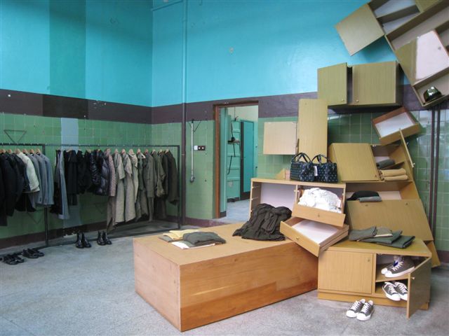
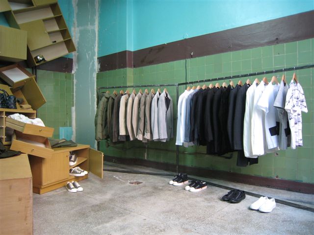
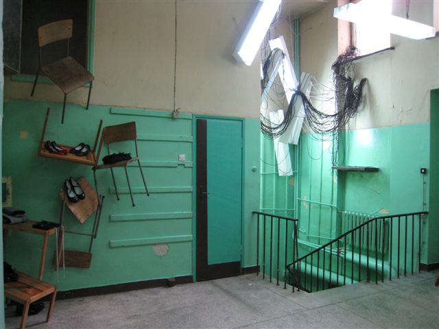
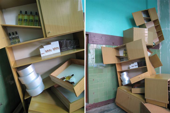
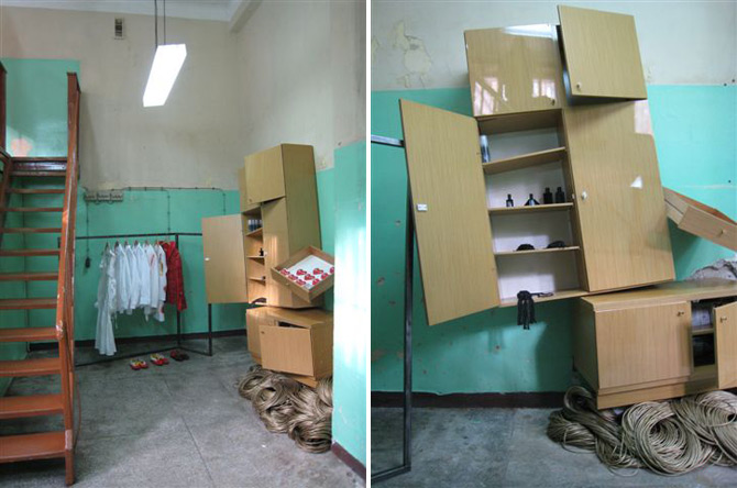
Comme des Garçons Guerrilla Store in Warsaw

gs-war-iii-12.JPG

by Orli Sharaby

Over the last few years, pop-up stores have moved from being a novelty to a phenomenon to a retail rite of passage. Now, hardly a week goes by that we don’t hear about some label or other setting up temporary shop in a shipping crate, public park, or even inside another store altogether.

But there’s something different about the Comme des Garcons version, which has never called itself a “pop-up shop” but rather prefers the nom de guerre “guerilla store.” CDG has been operating guerrilla stores since February 2004, setting up their first shop in East Berlin, then next in Barcelona and Singapore. Guerrilla shops have also popped up in Ljubljana, Reykjavik, Athens, and other cities around the world. Each shop stays open for one year only, and advertising is limited to posters and word-of-mouth. The locations for these CDG hit-and-runs are always in gentrified neighborhoods - the new Williamsburgs or Hoxtons of the world’s emerging cities.

The newest Comme des Garcons guerilla store has just opened in Warsaw, in a former fruit and vegetable store in a building from the Stalinist era. This is Warsaw’s third iteration of the shop - the first, which we were fortunate enough to visit 2 years ago, was located under a bridge in an abandoned passageway.


images via HYPEBEAST
via PSFK

Behind the Scene: Seemingly Unlimited Effort for Unlimited Orange

via Creativity

Poke, London explores the endless possibilities (and massive effort) in creating the UK brand's site.

While plenty of websites can feel infinite for all the wrong reasons, Poke London's colorful online creation for UK brand Orange is in fact designed as an authentic unlimited excursion, guiding visitors on a winding rainbow through a quirky, creature/activity-filled path that can absorb plenty of eyeball time.


Inspired by Orange's tagline that "good things should never end"—which is the foundation of the mobile brand's latest promotion—the site features mischievous-looking animals/ghosts/beings buzzing about along with a host of modules for people to play with and leave a mark forever. And with a constantly evolving landscape as its main ingredient, Poke, London obviously had its work cut out from the start. "It was massive, and [technically], it was managing all that stuff so that it doesn't crash, including the way the modules were loaded in and out," Poke creative director Nick Roope explains. "We brought in [visual designer] Marius Watz and guided him about how we wanted this rainbow to grow. We brought in an illustrator, Rex, who did the little black animations. We assembled all these different people, and we had all these different elements, and there was a massive management process to bring them all together. We had to load the [elements] in and out of memory as to when they were needed because if you've been scrolling down for 20 minutes and it's a whole 20 minutes worth of different things in memory, then it would at some point crash."


By installing user interaction outlets at virtually every twist and turn, the Poke design team covered a big loading process with little loading processes which contain fun challenges. "The user would have to interact with the modules to get them to load in the first place," says Roope. "But each module has its own creative mood that presents a challenge because you have to keep people engaged while loading so the fact that they feel like they're activating these things is a [feature] and they are reacting—but the [content] isn't fully integrated necessarily straight away. Then, obviously, in order to continue scrolling on the wall, people have to close those things down so that's one way we're managing it. Then, as you're scrolling down the pages, [the system] is obviously remembering where some things are, so it's randomly dropping things in and then unlearning them as you've passed."

Poke was also pulling double duty with the audio/sound design, first enlisting the services of BAFTA award-winning composer Nick Ryan to create the chirps, hyper-electro beats, revving motors and host of other noises. Next, the group had to insert and mix the sounds while considering the spatial aspects of the site. "We [needed] to know what's both directly on the screen and what's in proximity to it so we can start to play with the sound quality—usually it was 3D sound that's [ideal] for gaming—to create some of the audio effects so that you start hearing a sound before you see something. But then, obviously, the quality of the sound changes. It's creating the impression that it's an audio landscape as well as visual."

A landscape-styled creation is what Roope and company intended during the nearly three-month process to develop Orange's site, which the creative director understandably says is "...the most expensive one-page website I think I've ever worked on." Blending puzzle games, creature interaction, and other odds-and-sods time-killers with the slightest of branding (besides a few playful links scattered about), Roope emphasizes that the site concept is in line with Orange's mantra. "The whole idea of it is to communicate the notion of 'unlimited, ultimately.' That's why the client has financed it, because it's ultimately talking about the adventure of some of their products. We've very consciously tried to build that notion in to everything that we've done, but also in a very much more poetic way."


The CD counts among his personal favorite activities on the endless adventure to be the ice cream maker (pictured). "You're invited to create an ice cream, so you rapidly generate ice cream out of different [flavors] and toppings. You can control it to a certain extent, but it's random like a slot machine. Sometimes, you get random things like cheese, but every time you create something, you can decide whether to submit it or not. When you submit, you're asked to give your creation a name. It's very mildly creative, and it's user-generated content of the most senseless input. We're asking very little of people, but we're getting a very defined stimulus that attracts a lot of people."

With the plenty to be stimulated by and the potential for users to enjoy a long stay on the site, Poke found itself challenged by creating too much or too little. "The issue that [concerned] us most was just about repetition," Roope says. "We absolutely delivered on the idea of the unlimited because no page will ever look the same. As far as content is concerned, you're at some point coming past the same things you've seen before. Some of the elements, where you're adding your own things, they're different because they're obviously generated by people as they're interacting with them. In that situation, you're always going to come across fresh content."

"But the thing that we struggled with the most was just that what would be enough. How many things do you need to give most people to make them feel like it's gone on forever without having to go on forever? It's obviously going on forever in terms of generating actual fresh, different ideas each time, but otherwise, it would be unrealistic. That was the biggest struggle, collectively. But there's no point in creating more than what's necessary, and there was also a financial limitation in there as well. It's finding the balance between the elements."

Tuesday, November 6

Coup D'art

When they’re not busy attempting a coup d’etat on Denmark’s Constitutional Monarchy, the ArtRebels spend their time banding together for the causes of creativity. Originally, founded by Carla Cammilla Hjort as a record label boasting 100% artistic freedom, combined with an on-line music, art, and film shop whose sales would go towards supporting causes working to make the world a better place, ArtRebels has become much more.

As Hjort’s ambition to make “the coolest site online” grew, she began to amass a talented team to turn her dream a reality. The current ArtRebels Crew consists dj’s, musicians, film makers, graphical designers, promoters and selfmade rebels alike. All the members operate in the interest of attaining their own measure of success while assisting others in their artistic endeavors forming a global artist support system. The ArtRebels website features the work of all of its constituents ranging across the wide spectrum of artistry…from music, to fashion to the realm of visual arts, It is truly an amalgamation of talent and ideas for the benefit of creative folks everywhere. If you fancy yourself a rebellious artist perhaps you should join the revolution.

via Josh Spear

Gloom Box not Boom Box... (Nu Grave not Nu rave)


Poor little Nu Rave kids, there they were - being all inimitable and interesting and along comes thiefing trouble TopShop and turns the maverick mass - tsk, tsk Topshop, you really do bloody bore me.


As fluro flies off the store shelves, the 'cool kids' of the East End and beyond have been - very visibly - killing off their own culture. Enter fake blood, all black and a distinct turn away from all that they stood for, namely bright, lurid colours and a smack slash of something odd to beauty boot. Highly goth, this new movement is a touch ugly and very, very angry but fantastic all the same. No one wants to be copied, least of all the kids leading the world a-fashion-stray... And it's not just the clubs that are witnessing this either, 'Dark Tourism' is the new thing to watch, with attendance figures of places typically associated with death and disaster going up, up, up...

via Ruby Pseudo

In Japan: Toys for Big Kids

by Christine Huang

isobot-thumb.jpgWith their country’s birthrate declining and video game industry booming, Japan’s toymakers are taking a new approach to help bolster business - redirecting a bit of their attention from the kiddie market to focus on grown-ups. From R/C helicopters with infrared rays to model Ferraris equipped with turbo acceleration, toy producers like Tomy and Taiyo are putting more thought and money into toys for big kids to be sold at slightly more grown-up prices.

As Reuters points out, these not-just-for-kids toys “play to [adults’] childhood nostalgia as well as their love of high-tech” - and aim to reinvigorate an industry that saw a 6.3% decrease in revenue in the last year. We talked about Tomy’s i-SOBOT last month, a remote-controlled mini-bot that comes equipped with grips and a gyro sensor to stay balanced which Tomy expects will be a holiday hit in the adult market. And while big kid toys are priced above most children’s, technological advances have resulted in cheaper production and more reasonable price points, especially for toys like the once pricey robots. As Yamato Goto, spokesman at Tsukumo Robot Kingdom (a robot retailer in Tokyo) told Reuters: “You can build a robot for less than 100,000 yen ($870) now that can stand up, walk, do push-ups, back flips and dance.”

[via Reuters]

via psfk

Monday, November 5

Latest in Mortuary Marketing: Luxury Burial at Sea

via Adage
vidheader
Image
Marketing operations are about to start for a new cemetery located 45 feet below the surface off the coast of Miami.
Image
NEW YORK (AdAge.com) -- The latest news in mortuary marketing is luxury undersea burial. Fort Lauderdale's Neptune Society has opened an underwater cemetery city of fantasy-like architecture resembling an Atlantis of the dead. Interment prices range from $1,600 to $6,500 and the company's first big advertising push targets an upcoming convention of scuba divers. In other news in this 3 Minute Ad Age video report, NBC and Full Circle Entertainment are turning the 2000 ad agency novel "E" into a TV series and a new Google-MySpace project is expected to greatly expand social network advertising.
Thursday, November 1

personal info graphics

personal info graphics
---

via Designboom


'panda bear at bowery ballroom' by andrew kuo

a lot of people keep simple journals or take pictures to record their thoughts and track their activities, however
other people make elaborate and meticulous info graphics. two people employing this unconventional practice
are andrew kuo and nicholas feltron. andrew kuo is a new york based music fan and artist that tracks the minutia
of all things music related. nicholas feltron is a designer by trade and each year applies his design skills to craft a
personal annual report that tracks things such as where he travelled and what films he watched.


'manchester orchestra at radio city' by andrew kuo


'feltron annual report 2007' by nicholas feltron

via coolhunting

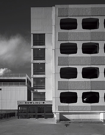
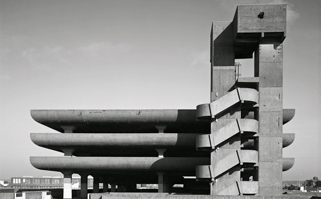
Parking Space

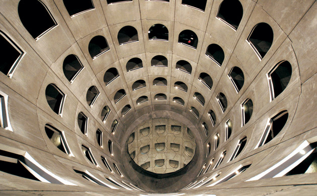
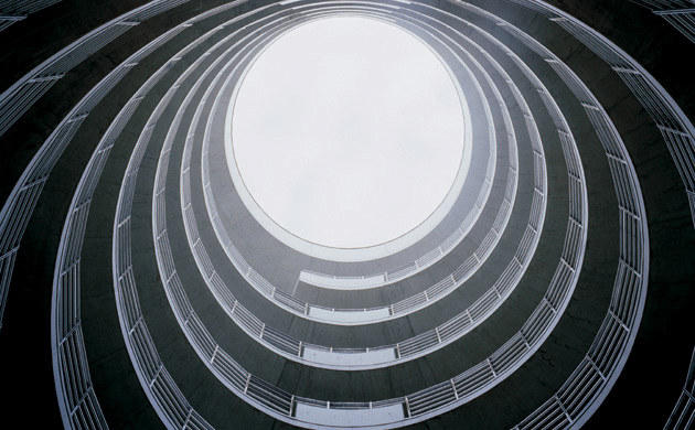
Parc des Celestins, Lyon

A seven-storey cylinder of space shaped by the inner drum' ... Parc des Celestins, Lyon, designed by Michael Targe, Jean-Michel Wilmotte, Daniel Buren. Photograph courtesy of Lyon Parc Auto. Photograph: Thames & Hudson

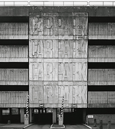
Pydar Street, Truro

Pydar Street, Truro. Photograph: Sue Barr/Thames & Hudson

Takasaki Parking BuildingTakasaki Parking Building

'An architect who has sought to 'de-emphasize the solidity of architecture'' ... Takasaki Parking Building. Photograph courtesy of Kengo Kuma & Associates. Photograph: Thames & Hudson

Marine Parade, Worthing

Marine Parade, Worthing. Photograph: Sue Barr/Thames & HudsonTricorn Centre, Portsmouth

'Using formal expression to overcome any shortfall in the quality of construction' ... The Tricorn Centre, Portsmouth, designed by The Owen Luder Partnership.

Photograph: Sue Barr/Thames & Hudson

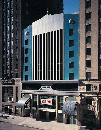
60 East Lake Street, Chicago

'Replicates a mutant pre-war roadster's radiator grille' ... 60 East Lake Street, Chicago. Photograph courtesy of Tigerman Fugman McCurry. Photograph: Thames & Hudson

Brighton Marina

Brighton Marina - the development initially closed in 1979 after only the car park had been built.

Photograph: Sue Barr/Thames & Hudson


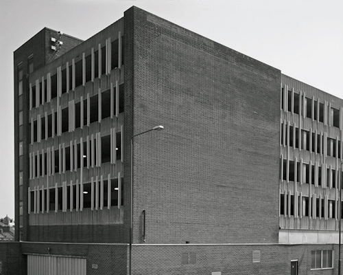
Calderwood Street, Woolwich

Calderwood Street, Woolwich.

Photograph: Sue Barr/Thames & Hudson

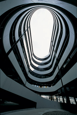
Car-Park Rotundas, Hamburg Airport

'Entry and exit ramps entwined in a highly refined double helix' ... Car-Park Rotundas, Hamburg Airport. Photograph courtesy of Von Gerkan, Marg & Partner.

Photograph: Thames & Hudson
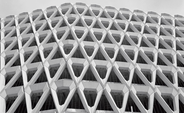
Debenhams, London

'Illustrates beautifully the convergence of tectonic matter and geometric composition' ... Debenhams, Welbeck Street, London, designed by Michael Blampied.

Photograph: Sue Barr/Thames & Hudson

via Guardian

The Modern Charlie & The Chocolate Factory

Posted by Yanko Design

If Charlie ever imagined what a modern chocolate factory would look like, he’d probably never have thought it would look like this. Then again, he’s probably never visited Mexico.

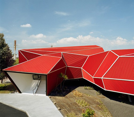
When Mexican architect Michel Rojkind was asked to redesign the spaces inside the Nestle chocolate factory for the daily draw of visitors it receives, the architect proposed creating a whole new structure to initiate the visitors into the Nestle experience. This new building would become a museum and would introduce visitors to the history of this sweet cocoa-bean derived candy.

After making their proposal, Rojkind and his team were quickly put to task in creating the structure, with design and construction taking place in two and a half months, putting even the fastest-track building projects in China to shame.

Situated along the main highway into Paseo Tollocan, the entire, horizontal sculptural structure has become an instant landmark for tourists arriving to tour the Nestle factory. The entirety of Rojkind’s structure is rested on concrete pillars, raising the structure entirely off the ground.

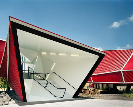
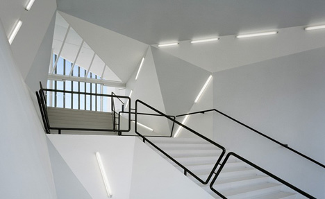
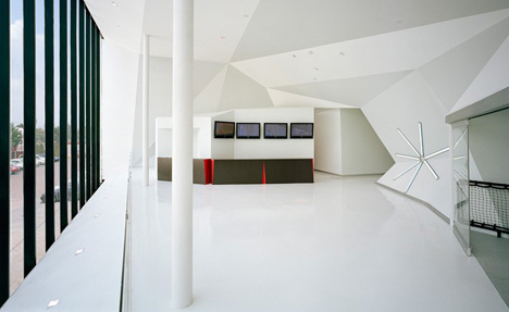
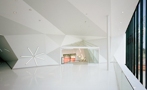
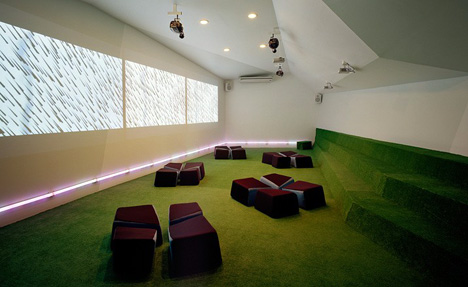
The multi-faceted structure creates equally compelling abstract spaces inside, housing a child-friendly visitor’s reception area, a museum shop, and a theater. From the outside, the museum, with its subtly zigzagging volumes, begins to look like a large abstract caterpillar, clad in red corrugated steel panels.

Those who are wondering where the factory is, worry not; the building funnels directly into the factory, where the chocolate is actually made.

Architect: Michel Rojkind