Mole Architects, working with Freeland Rees Roberts, has designed a sustainable extension to Cambridge’s architecture faculty
The architecture school at Cambridge has always had an influence disproportionate to its modest size. Existing in embryonic form since Edwardian times and based since 1924 at Scroope Terrace, until the recently completed programme of renovation, with an extension by Mole Architects with Freeland Rees Roberts, it had been extended only once in almost 100 years.
The first extension was built soon after the appointment of Leslie Martin as the first chair of architecture in 1956, marking the start of the modern era of architectural education, not just in Cambridge but for Britain as a whole.
Less that four years ago, Cambridge’s department of architecture was threatened with closure, provoking a vigorous campaign attracting high profile support and publicity, not least from its many famous alumni. The school survived but its highly respected graduate programme did not, stripping the school of its diploma and ability to send RIBA part II-accredited students out into the world of practice.
Essentially, it was the victim of a combination of government funding policy, which awards funds on the basis of research points, and Cambridge University’s ambivalence towards the status of architecture as an academic subject. The department’s funding crisis has led to a radical restructuring in every way.
Head of school Marcial Echenique is in a relaxed mood as he shows me around the extension. The new sawtooth-roofed eco-studio building for undergraduates has been complete for some months, and research staff have just moved from the old Martin Centre a mile away to refurbished offices in the 1830s Victorian terrace rooms which were previously occupied by students. With the future secured, he has plans to step down as head of school, having been involved with the department, particularly on the research side, since the sixties.
Part of the deal struck with the university to unite research and studio teaching was the sale of a valuable Victorian villa that had housed the Martin research centre, formerly the Centre for Land Use and Built Form Studies, set up in 1967.
Arguably, the £3 million project is not an expansion, more a consolidation on one site. With its important academic links with the adjacent engineering department and a tradition of one-to-one tuition, relocation or significant expansion of student numbers was not seen as an option.
Echenique explains that he had a sketch design for the new building but the university wanted to employ an outside architect for contractual reasons. Mole Architects, a young practice known for its impeccably sustainable Fenland houses, was approached to design the new studio building in the garden. Cambridge architect Freeland Rees Roberts worked with Mole and was entrusted with renovating the terrace.
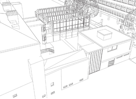
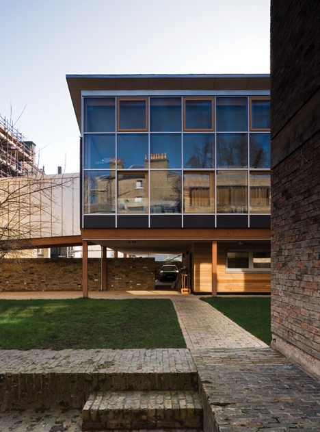
Built for around £1 million with impressive speed, the elevated volume of the studio space is set away from the rear of the terrace and overhangs a blockwork workshop at garden level and a large faculty parking area to the south. It is raised up on laminated timber columns and beams, and links to the raised ground floor of the Victorian building with a timber-framed bridge clad in zinc. Similar to an internal air link, it ramps up gently to dock with the new building.
Emerging through double-glazed doors into the columnless space, a wall of glazing on the right looks north across the garden and faces on to the brick golden section of Colin St John Wilson and Alex Hardy’s 1958 extension.
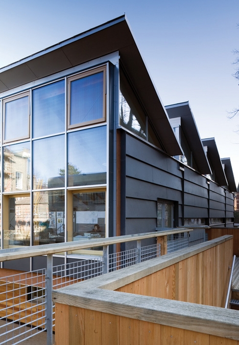
Both are what the Japanese would call “flagpole” buildings, the main accommodation accessed from long, narrow connecting pieces which negotiate changes in level. In the older building, this is done with half-level stairs. To provide level disabled access between studio and lecture hall, an external timber bridge structure now encloses the garden to the west.
This rather provisional-looking solution avoids the deployment of an impossible number of stair lifts, but the perfect enclosed profile of the older building seems to reject the advances of the new one’s wooden arm.
Once climbing plants have been persuaded to grow on the steel mesh balustrade, this should be less of an issue. A continuous circuit at first floor level with an external stair down to a kind of cloister promises to contribute to a pleasant working environment in the summer.
“To provide disabled access, an external timber bridge structure encloses the garden” |
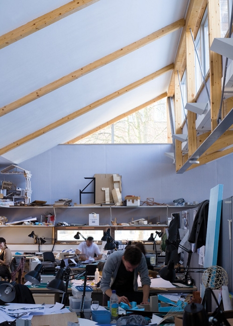
The four-bay timber and steel-trussed structure spans 15m, the structural diagram exaggerated with thinner steel chords and bracing acting in tension. The planes of the sawtooth roof, tilted to receive north light, rest on timber rafters. The sides of the roof lights are glazed and provide high level views to the terrace and the trees in front of the engineering block to the west.
Echenique’s own 1974 house in Cambridge provided the model of a lightweight timber architecture somewhat akin to the Segal method. To make the new building both lightweight and a case study in sustainable design, an innovative system of water pipes set into panels in the roof is linked to underground bore holes. These provide water to stabilise the temperature, cooling in the summer and heating in the winter. This system, together with a series of high level manually switched opening windows, should ensure a comfortable environment with little external input of energy.
Work to the terrace has focused on updating services, installing a new lift and regularising circulation around central spine corridors. The excellent library, shared with the art history department, has also been extended in the basement to incorporate some of the research department’s volumes. Services have been carefully concealed throughout, most successfully with natural ventilation ducts in the chimneys, which means the front sash windows do not have to be opened to the road.
Elegant fuschia
Grand rooms on the first floor have been painted with rich colours, and all cornices, window shutters and joinery have been restored to their original glory. The elegant fuschia-pink boardroom has a huge flat screen on one wall; unfortunately, the effect is spoilt by some rather tricksy lights over the conference table.
Elsewhere, sympathetic restoration of the rooms is undermined by use of strip lighting and plastic conduit from the world of the cheap office fit-out. Plywood screens with glazed upper panels are used as devices to partition off smaller offices within larger rooms at the rear along the central spine corridor. These devices cleverly conceal horizontal service runs but sit uneasily against the fine joinery and detailing of the Victorian terrace. The glazed panels are intended to offer an uninterrupted perception of the colour fields of the larger rooms but meet ceiling and cornice rather awkwardly.
For students — presuming it is these who the architecture department is for — the school needs an area where they can meet and exchange ideas, where individual or group work can be carried out, and a representative place for exhibitions and lectures. The 1958 extension has been carrying out the latter functions for 50 years, and does not look the worse for wear. If anything, it now forms the permanent backdrop to the department as the character of most of the terrace and garden has been altered.
Seen from outside, Wilson’s building seems bloody-minded and inscrutable, with its expressed concrete slab and brick wall. Like many buildings in Cambridge from this era, its bespoke modernism of rich materiality and spatial complexity has to be appreciated from inside. The spaces are introverted and, perhaps fortunately, you can’t see the new building in the crit space or lecture hall.
The new studio does not speak the language of permanence, nor indeed does it give the suggestion of utopia that temporary architecture can offer. The lightweight materialisation of the new building forms an interesting counterpoint to the heavy tectonics of the brick box but in this context needs to offer much more than just a neat structural and environmental diagram. Little thought seems to have gone into the use of the room beyond creating a large, shed-like space.
Curiously old-fashioned
This is not just a flexible area that students can do what they want with, but a regimented arrangement of desks and low partitions with some 120 undergraduates packed in. The studio has the feel of a call centre in an agricultural building, the envy of any Fenland gangmaster, or perhaps a curiously old-fashioned architect’s workroom, where technicians of the past would have slaved over drawing boards in white overalls. Except for flimsy office partitions, there are no walls to pin up drawings, while wall-mounted shelves have quickly accumulated assorted models and junk.
It is perhaps the fate of almost all architecture departments to burst at the seams, and a rethink of the interior fit-out could certainly improve matters. The innovative approach of the building to sustainability is laudable, and it boldly sets out the new direction of the school, but you can’t help but wonder that something is missing.
project team
Client University of Cambridge, Architect Mole Architects with Freeland Rees Roberts Architects, Engineer Scott Wilson, Quantity surveyor Gardiner & Theobold, Mechanical and electrical Max Fordham, Project manager Hannah Reed, Main contractor ISG Dean & Bowes
specifications
- Glulam frame Constructional Timber, Stainless steel roof Ugitop, Gutter lining Alwitra Evalastic, Breather membrane Proctor, Windows Rationel, External cladding Eternit Natura, Insulation Isowool, Radiant heating Variotherm, Linings Fermacell, Lighting Erco Parscoop, Curtain wall Seufert NiklausOriginal print headline: Cambridge resurrection


via BD the Architects' website


As always an excellent posting.The
ReplyDeleteway you write is awesome.Thanks. Adding more information will be more useful.
Bathmate