 |
 |
 |
 |
 |
 |
 |
| THE KINGS AND THE QUEENS pictures made with Johann Besse for Magazine |
FLORENCE is a graphic designer & illustrator, & JOHANN is a photographer. They live and work in Switzerland.
 |
 |
 |
 |
 |
 |
 |
| THE KINGS AND THE QUEENS pictures made with Johann Besse for Magazine |
FLORENCE is a graphic designer & illustrator, & JOHANN is a photographer. They live and work in Switzerland.

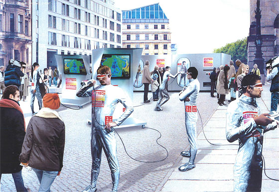
Photo: Courtesy of Uniqlo
Uniqlo is promoting its new Heat Tech innerwear by giving it away for free in Times Square next month. Three cheers! Free clothes! But the best part is how they plan to distribute the clothes: with a "giant human vending machine." Above you see a rendering of said giant human vending machine. We didn't understand what a giant human vending machine was, so we called up a Uniqlo rep to find out. This is how she described it:
"Basically we’re going to have two mimes. A male and a female mime inside the machine. And the public can see them through glass. When you get there, we’re going to have Uniqlo reps dressed in the silver bodysuits. And they’re going to hold a thermograph scanner — think of an airport security machine. The thermographer identifies cold spots in your body. After you go through that, you go to the vending machine and push a button and the mimes are going to do a synchronized choreographed routine and then your outfit comes out."
Oh hell yes. Women will go to the women's side and men will go to the men's side and get outfits for their respective genders. However only one size will be distributed, which "should fit your average body type." A few thousand will be given away. Here are event details:
WHAT: Free Uniqlo Heat Tech Innerwear Distributed by Giant Human Vending Machine
WHERE: Military Island, Times Square
Broadway and Seventh Avenue, between 43rd and 44th Streets
WHEN: Tuesday, November 18, 1 p.m.
via NY mag
![]()
The Hako-ie “house in a box” is an assembly-type Japanese-style room that you can set up inside a larger space. Made with excellent materials and fine techniques, with attention to the smallest detail. It has tatami mats, as well as an arched ceiling, a lacquered tokonoma corner, and even a wooden veranda. It can be assembled or disassembled in an hour and requires no nails or screws, just a hammer and battens. A winner of the Good Design Award 2008.
via Daily Icon
Hako-ie, by Asao Sakamoto, Sakamoto Urushi Manufacturing Co., Ltd., Best 15, Good Design Award


Nendo renovated an olf wooden house on the Shibuya River in Tokyo into a live-work space.
The house had accumulated some strange and wonderful features, like an inner courtyard, an oddly long hallway and a tiny room, from a series of earlier renovations. The hallway became a study, and the small Japanese-style room a studio.
Veins of moss pattern were used on the interior walls to connect existing spaces with newly-renovated ones. The same pattern appears on the cable outlet, and on the doorframes and door handles of the office.


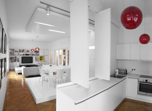
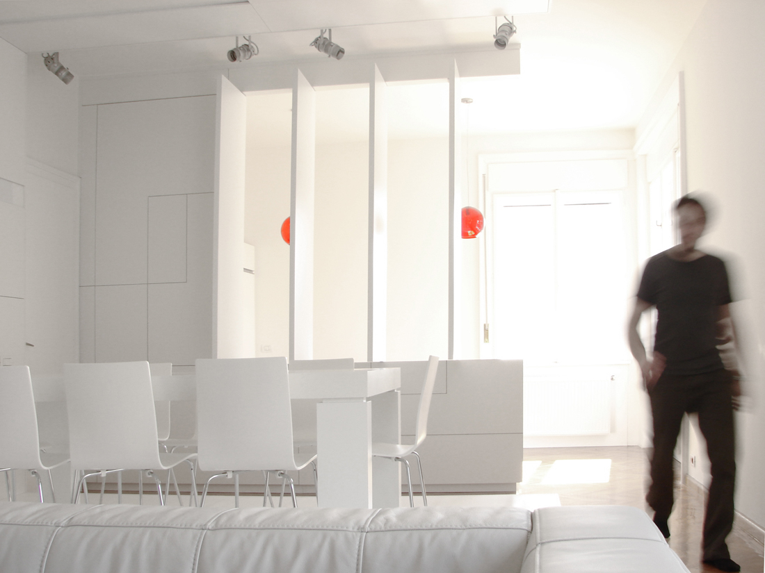
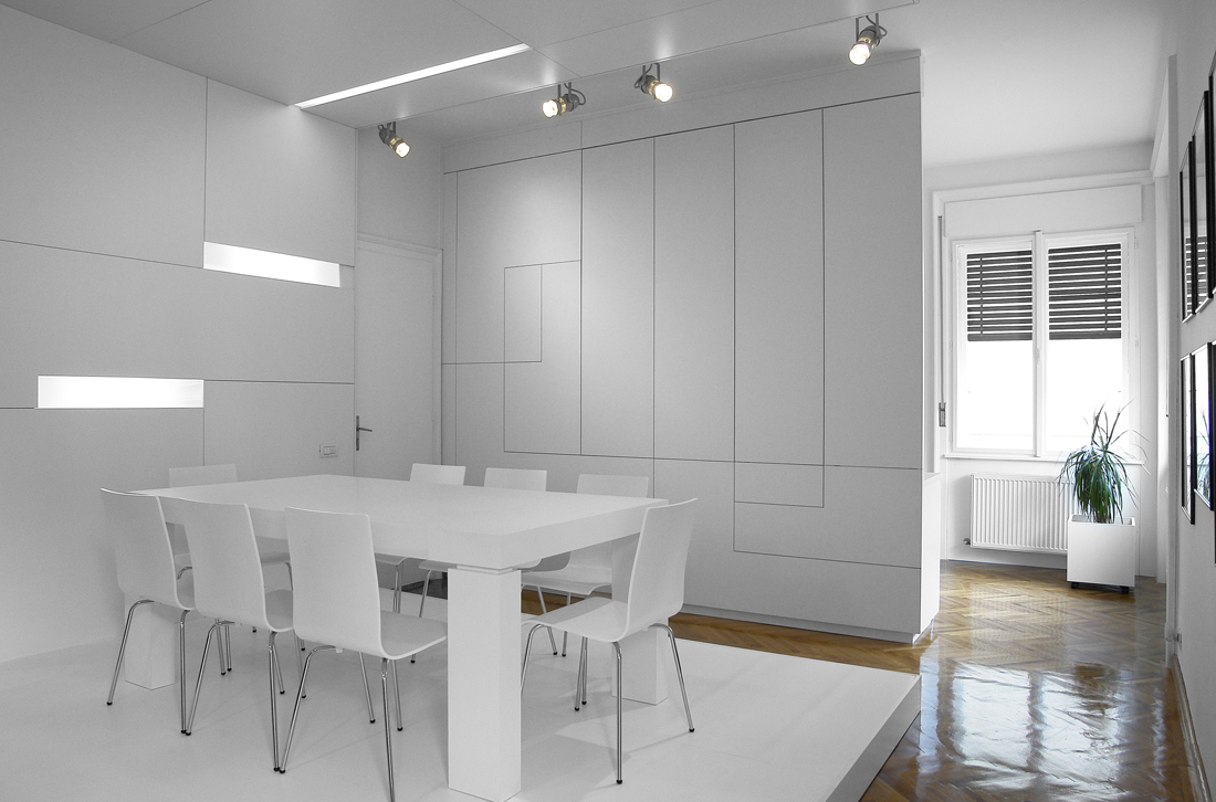
The initial configuration of the apartment is almost entirely maintained. The original woodwork and metalwork are entirely refurbished and integrated within the concept, endowed with a contemporary “plastic” materiality. Also the wood parquet was maintained and treated as a valuable feature of the apartment that tempers the new intervention and confers “warmth” to the living areas. The general appearance of “septic” white is counterbalanced by the paneling, the color of the niches, the lighting units integrated in the furniture and the personal objects of the owners.
According to Mitchell L. Stevens, a sociologist at N.Y.U. and the author of “Kingdom of Children: Culture and Controversy in the Homeschooling Movement” (Princeton, 2001), home-schooling is becoming more popular in New York City, with more than 2,600 students registered this year, up from nearly 1,600 in 2001 (New York City Department of Education).
“In one sense it is hyperparenting, an extreme version of bourgeois parenting,” he said. Parents, he said, are anticipating a world in which children will have to be ever more flexible and creative, and some home-schooling parents believe their approach will provide that edge.
Read the article by Penelop Green in the NYT


In line with these, CCD recommends that CPGs consider strategies such as branded merchandise sections within supermarkets/grocery retailers that link products with a chef (so as to appeal to the allure of sophisticated, high-end prepared meals); adding restaurant-inspired sides and desserts to entrée lines; and emphasizing frozen and fresh-prepared meals that offer ingredient "purity" and "global inspiration."
If supermarkets are the new restaurants, surely restaurants have to be the new home
More on restaurants trends shortly in the meantime you can enjoyed the credit crunch chocolate designed by Purpose for Selfridges

And read this on the subject

Architects: Sou Fujimoto Architects
Location: Oita, Japan
Project Team: Yumiko Nogiri
Structural Consultant: Jun Sato Structural Engineers
Design Year: 2006-2007
Construction Year: 2007-2008
Site Area: 236,57 sqm
Constructed Area: 150,57 sqm
Photographer: Iwan Baan


