In honor of the currently unfolding (ha) Fashion Week in NYC, I thought I’d post on some of the terrific typography at work in the fashion world. When I first got into design, I used to think the typeface for the Louis Vuitton logo was the epitome of graphic design. I remember writing everything in Futura Medium for a good month (even research papers, nothing was spared). These days, I still to pick up the occasional GQ or etc just for the ads — usually can pick up a few interesting things. There are always a number of logos that catch my eye, continue reading to see some of the marks that resonate most.The mark for The Fashion Center (above) is perfectly simple. How brilliant to utilize the button holes to form the F! This is probably one of my favorite logos of all time. What it comes down to for me is that the 5th button hole is slightly smaller than the rest — this subtle scale shift makes the whole thing. Developed at Pentagram.
Selected Typography of the Fashion World
You don’t see too many slab serifs in the fashion world — this one for Iceberg is my favorite. Bally is OK too, but I prefer the “B” in the Iceberg mark for the details (no bottom slab). Also, it’s sort of unfair, but Iceberg is a cooler word and thus I find it more appealing.
Tom Ford probably has one of the most photogenic names in the business. The two words strike a great balance and convey the boldness of the brand very effectively. It announces itself proudly and authoritatively, and is somehow able to be colored pink/violet and still seem completely bad ass.
This one is an uber-classic. Designed by Cassandre in 1963, the Yves Saint Laurent lettering has always had a mysterious air to it for me. Maybe it’s because I could never figure out how to pronounce it. Anyway, the kerning in this one is masterful — just look how smoothly the letters flow into one another.
One of my favorites for its simplicity. The Helmut Lang logo says to me that they don’t mess around — they make classic and quality clothes without comprising their core principle of (stylishly minimal) utility.
Dunhill takes a slightly different approach than most. Seeing the ascenders ascend to new heights is certainly a nice change of pace. It stands out amongst the more typically “restrained” fashion logo. Whether accurate or not, I get the feeling that (like a Paul Smith) there is some extra dose of personality and flare to what they do.
Trussardi has one of the best crests. I’ve seen other brands try this approach (see Juicy), but rarely are they able to achieve such a sense of heritage and refinement like Trussardi. There is even a little touch of playfulness if you look closely at the greyhound in the middle; he looks like he’s up to something.
I love the Hermes identity. The logo is great — especially love the rendering of the horse and buggy — but the real winner for me is the color. If you walk into a Hermes shop, you know you where you are immediately because of the crazy and unusual blends of colors you find yourself surrounded by. A nice contrast to the muted tones of some of the above.
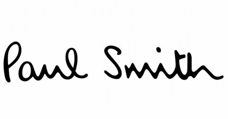
Of all the script logos in the fashion world, Paul Smith is my favorite. It’s hard to imagine the brand without his signature color rainbow, but I think the lettering alone still does a great job summing up what the brand is all about. Seeing this lettering inside of an extra sharp suit somehow makes complete sense, especially when you see that the lining is bright purple.
I know I said Paul Smith was my favorite hand written face, but Salvatore Ferragamo comes pretty close. Each letter is wonderfully drawn if you take them individually — they all have interesting little quirks and imperfections that come together nicely. It’s hard to tell if I like this one because of the actual rendering or just prolonged exposure.
This condensed face is not the official logo of Zadig and Voltaire, but I enjoy it anyway. Their current logo (which you can see on their site) is great, but my love of condensed type always led me to prefer this one. I suppose the current one has more personality (especially in that “g”!) in the end.– -
Definitely left a few out I know; Chanel, Louis Vuitton, maybe even American Apparel. Let me know if there are any others!
Tuesday, April 6
ISO50 - The Blog of Scott Hansen » Typography of the Fashion World
via blog.iso50.com
Subscribe to:
Post Comments (Atom)




Boca do Lobo usually gets inspiration from Bally and their wonderful pieces. The attention to detail and the exclusive feeling of this brand are an example to us all at Boca do Lobo.
ReplyDeletePASSION IS EVERYTHING
Boca do Lobo
The first thing that you see in a brand is it's name/logo even before you take a closer look at their designs. So I guess their names/logos should be something that is catchy. My favorite has got to be Tiffany - not sure if it's because of the name/font/that I know that these are jewelries. But I like it nevertheless. Wholesale Handbags
ReplyDeleteAt last! I found a good post like this.. Thanks for this informative post! By the way, can you write a post about xanga for seo? Thanks again!
ReplyDelete