BY Cliff KuangThe new device could radically improve healing times for tens of millions, at a cost of $3.
No one really knows why, but for an open wound, simply applying suction dramatically speeds healing times. (The theory is that the negative pressure draws bacteria out, and encourages circulation.) But for almost everyone, that treatment is out of reach--simply because the systems are expensive--rentals cost at least $100 a day and need to be recharged every six hours.
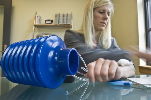
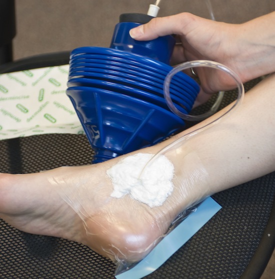
No more. Danielle Zurovcik, a doctoral student at MIT, has created a hand-powered suction-healing system that costs about $3. The device is composed of an airtight wound dressing, connected by a plastic tube to a cylinder with accordion-like folds. Squeezing it creates the suction, which lasts as long as there's no air leak. What's more, where regular dressings need to be replaced up to three times a day--a painful ordeal--the new cuff can be left on for several days.
Zurovcik originally intended to field-test the device in Rwanda, but then the Haiti Earthquake struck. At the request of Partners in Health, an NGO, she traveled to Haiti with 50 of the pumps.
Currently, Zurovcik is verifying the healing benefits of the device, and developing a new model that can be readily carried and concealed. The one technical hurdle that remains is ensuring the bandage seals tightly--but after that, the device could benefit a huge portion of the 50-60 million people in the developing world that suffer from acute or chronic wounds.
[Top image: Melanie Gonick/MIT; Bottom image: Patrick Gillooly/MIT]
Thursday, April 15
MIT Student Develops $3 Cutting-Edge Healing Device, Field Tested in Haiti | Fast Company
Tuesday, April 13
Travel Leica: Cities, People, Perspectives | TrendLand -> Fashion Blog & Trend Magazine
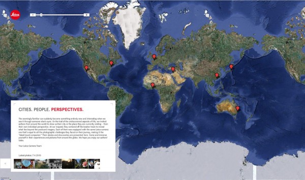
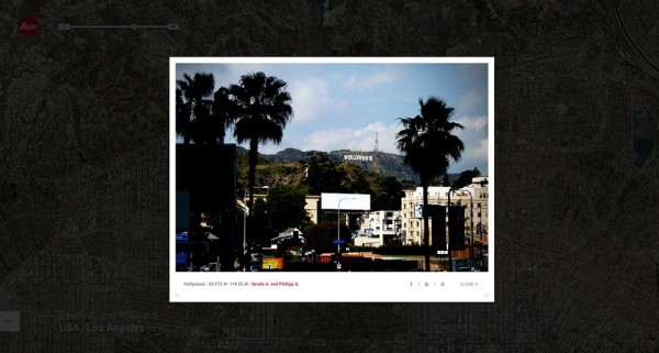
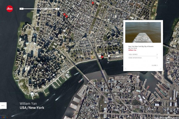
Leica recently launched their micro-site/Social Media platform, called Cities, People, Perspectives, paired with Google Maps, they brings together a variety of photographer from around the world, showcasing their pictures shot with their Leica (obviously).
Monday, April 12
Retail Evolves: Shop Out In The World With Visual Search | MobileBehavior
With tools like RedLaser, Amazon, and Google Product Search all running on our mobile phones, retail stores have come under threat of becoming simple display rooms. Users get hands-on with products, decide whether or not they like, and then price check or order online.
Frog Design looks even further into the future, envisioning the entire world as a display case.
In the future nearly every visible thing will be cataloged and indexed, ready to be instantly identified and described to us. Want to go shopping? In the future we won't need big retail stores with aisles of objects on display. We'll be able to shop out in the world (see image, above). Do you like that new car you saw drive by? Or those cool shoes on the woman sitting across the room? All you’ll have to do is look at it and your mobile handset or AR-equipped eyeglasses will identify the object and look up the best price and retailer.
With recent developments in image recognition technology, and Google's acquisition of Plink, this seems entirely possible. While this is definitely further down the road, think about how brands would get their product out into the marketplace. Product placement would take on new meaning.
Coke + Emeco: Get Hitched, Spawn Chairs | Design of the Times | Fast Company
Now you can have your Coke and sit on it too.
On the eve of the world's biggest furniture fair, two classic brands--Coca Cola and Emeco, manufacturers of the iconic 106 aluminum Navy chair--are announcing the rainbow-hued progeny of their new collaboration.
Each new Emeco 111 Navy Chair is made of 111 recycled plastic bottles. Over the course of a year, Emeco estimates it will process more than three million PET bottles to produce the product, which will be sold for $230 at Design Within Reach.
Designed in 1944 for the U.S. Navy, the original Emeco chair takes 77 steps to produce and includes a process that alters the aluminum's molecular structure so that it's three times harder than steel.
The new chair won't be quite so tough, but will provide a way for PET to be up-cycled. Each chair will contain a mix of 60% PET and a combination of other materials, including pigment and glass fiber for strength.
"Although re-engineering a core product is a significant investment for us, I was excited...to turn something many people throw away into something you want and can keep for a long, long time," says Gregg Buchbinder, chairman of Emeco.
The chair will come in six colors, chosen by designer (and Fast Company expert blogger) Laura Guido-Clarke: Coca-Cola Red, Snow, Flint, Grass, Persimmon, and Charcoal.
Reached in London on her way to Milan, Guido-Clarke offered this: "The colors needed to complement the form of the chair and the qualities of the new material. Because the chair and Coke are classic, the colors reflect a sense of modern heritage. They connote a sense of history but were pushed enough to feel refreshing." Her personal faves? The charcoal and the green. "And together, they make me really happy!" she said.
On May 1, the collaborators will launch a Web site, www.111navychair.com, to house the "111 Navy Chair Project." The companies will be sending the chairs out to various artists, celebrities and designers for comment, and will post their responses. In other words, stay tuned. And keep recycling responsibly.
Putting people first » Your life in 2020
Forbes Magazine, in collaboration with Frog Design, has been looking at what the future in 2020 might look like in a range of areas: computer, choice, classroom, commute, home, job, diet, health and reputation. Some articles are clearly more inspired (and less technology and US-centered) than others. Many scenarios are far too optimistic, and I miss some broader socio-economic and environmental analysis. What could be the real consequences of privacy concerns, crime, cultural differences, war, climate change, overpopulation or poverty in all this?
Here is for instance a quote from one of the scenarios (about social networking in 2020) that, when thinking about it, would open up a huge range of privacy and security problems, none of which are acknowledged or addressed:
“The virtual display could be used to illustrate relationships between a group of people. A husband and wife might be linked by a thin glowing tether. Flowchart arrows could indicate if one person is another’s boss. Even former friends–people who were once connected but severed ties–could be identified with broken chains or angry lightning bolts.”
This lack of broader contextualisation makes the whole exercise somewhat naive and superficial. That said, here are my preferred pieces (with Steve McCallion’s one – addressing some of the issues mentioned above – my personal number one):
Your life in 2020
by John Maeda, president of RISD
In 2020 we might just regain some of the humanity that was lost in 2010.“So, what will take technology’s place? It begins with art, design and you: Products and culture that are made by many individuals, made by hand, made well, made by people we trust, and made to capture some of the nuances and imperfections that we treasure in the physical world. It may just feel like we’ve regained some of what we’ve lost in 2010.”
Your computer in 2020
by Mark Rolston, chief creative officer at Frog Design
Traditional computers are disappearing; human beings themselves are becoming information augmented“When computing becomes deeply integrated into our knowing, our thinking, our decision processes, our bodies and even our consciousness, we are forever changed. We are becoming augmented. Our first and second lives will be forever entwined.”
Transportation in 2020
by Steve McCallion, executive creative director at Ziba Design
In 10 years, your commute will be short, cheap and, dare we say, fun.“In 2020 a new generation will emerge from a period of frugality into one of resourcefulness and resilience. Americans will start searching for transportation solutions that are smarter, healthier, slower and more social.”
The classroom in 2020
by George Kembel, cofounder and executive director of Stanford University’s Hasso Plattner Institute of Design
The next decade will bring an end to school as we know it.“In 2020 we will see an end to the classroom as we know it. The lone professor will be replaced by a team of coaches from vastly different fields. Tidy lectures will be supplanted by messy real-world challenges. Instead of parking themselves in a lecture hall for hours, students will work in collaborative spaces, where future doctors, lawyers, business leaders, engineers, journalists and artists learn to integrate their different approaches to problem solving and innovate together.”
Reputation in 2020
by David Ewait, Fortune Magazine
Social networks change the way we look at the world and introduce new economic incentives.“Web-based social networks are cutting-edge technology in 2010. By the year 2020 they’ll be so commonplace–and so deeply embedded in our lives–that we’ll navigate them in the real world, in real time, using displays that splash details over our own field of vision. We’ll even use the social capital that results from these networks as a form of currency.”
But if you understand French, it is useful to compare these insights with the five videos broadcast on the France 5 channel: vivre en 2040.
Sunday, April 11
Gatorade campaign wins top honors at ANDY Awards - Boards
In Replay, Gatorade restaged well-known high school sports rivalries 15 years after the fact.Replay, an integrated Gatorade campaign from TBWA\Chiat\Day, Los Angeles has won the Grandy prize at the 2010 International ANDY Awards in New York last night.
Launched online last May, the doc-style branded content series restaged classic games between high school sports teams 15 years after the fact. Originally conceived as five webisodes (produced by Caviar Content), the show was picked up by Fox Sports Net in the fall and is now in its second season.
Inspired by a statistic that only three in 10 adults over age 30 exercise regularly, the campaign was designed to rekindle the athletic instincts for those in that demographic. Replay was awarded the Grandy in the Earned Media category and has generated 154 million online impressions since its debut.
In total, ANDYs jurors awarded 21 gold, 13 silver and 11 bronze prizes. JWT and Leo Burnett were the top-winning agency networks with six awards each, followed by Euro RSCG with five, TBWA with four and DDB with three.
Gold-winning TV work included Euro RSCG, New York's popular The Most Interesting Man in the World campaign for beer brand Dos Equis; Publicis Mojo, Sydney's unusually subtle beer commercial "Pure Waters" for James Boags Draught and Euro RSCG, Paris' action-packed "Closet" ad for French broadcaster Canal+.
We Choose The Moon, The Martin Agency's virtual, real-time recreation of the Apollo 11 moon mission for the John F Kennedy Presidential Library picked up a gold in the public service category, while BBH, London's single-take "The Man Who Walked Around the World" spot for Johnnie Walker nabbed gold in the long-form category.
Leo Burnett, Chicago's Tampax film "Zach Johnson", directed by Smuggler's Randy Krallman, scored three gold awards for video/cinema direction and branded content, respectively, while Leo Burnett's London office picked up gold in the integrated category for Shelter "House of Cards". Cummins Nitro, Melbourne's Best Job In The World campaign for Tourism Queensland, a big hit on last year's award circuit, also won a gold for branded content.
Three new categories were introduced this year. TBWA\Hunt\Lascaris, Johannesburg's The Trillion Dollar Campaign for The Zimbabwean Newspaper won gold for Earned Media; Goodby, Silverstein & Partners, San Francisco picked up gold in the Best Program to Make People's Lives Better category for Hyundai Assurance. Crispin Porter + Bogusky's Twelpforce campaign for Best Buy meanwhile won a gold for RESET, which recognizes unique thinking and unusual approaches.
Wieden+Kennedy, Portland's Chalkbot campaign for the Nike Livestrong Foundation won the Richard T O'Reilly Award for Public Service. The campaign gave web users around the world the chance to chalk the roads along the Tour de France route with messages of hope in the fight against cancer. The agency used a robotic chalker - or Chalkbot - to deliver 36,000 messages during the 25 day event.
In the student competition, an idea from the Miami Ad School Europe in Hamburg won the The Glenn C Smith Scholarship prize for the second consecutive year. The award was given in the Branded Applications category to Bjorn Borstelmann and Thibault Gerard for The Voiceipt Campaign for The Swedish Tax Agency.
This year's ANDY Awards were co-chaired by former JWT chief creative officer Ty Montague and Big Spaceship founder Michael Lebowitz, who sought to inject new life and buzz around the showcase by crowdsourcing this year's jury through the Elect The Jury campaign.
"I'm so proud of how the ANDYs reinvented itself this year. As a first for any advertising awards show, we engaged the community to Elect the Jury," Montague said in a statement. "The process provided us with a fresh mix of talent to evaluate the submissions in all categories and mediums."
For the complete list of winners, visit the Andy Awards site.
Thursday, April 8
‘Local’ Debuts In Milan | We Heart: Essential Lifestyle Guide
Time for the influx of jaw-dropping new design from this year’s Milan furniture fair… first up for us is this beautifully unconventional new label from the most unexpected of places, the United Arab Emirates. With the goal of stimulating the design scene of the U.A.E, Rami Farook – the founder of Dubai based art and design collective, traffic – has conceived ‘Local‘, a new brand that sees designers and artists create outside their usual mediums….. an architect designing seating, a media artist working in product design. With a launch collection that features chairs, sofas, benches, loungers, coffee tables, lighting and storage debuting next Thursday at Zona Tortona, Local is one of the key new brands to watch….

Leica CITIES.PEOPLE.PERSPECTIVES Website | SLAMXHYPE
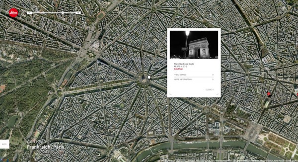
Leica have unearthed this most recent project, compiled of highly regarded influencers. Entitled CITIES.PEOPLE.PERSPECTIVES this initiative was designed to offer a look into the lives of these peoples, with a look at their city and travels. Featuring William Yan, Sevada A. & Philipp S., Anh Phan, Nii Obodai, TK and Tomohiro Fujii, the website has been created along with Google Maps providing viewers of details about the location of each shot. Take a look below at some of the highlighted images while check back for regular updates.
Thanks to TK for the info.
Tuesday, April 6
Frog Design Imagines Urban Food Systems of the Future | Sustainability | Fast Company
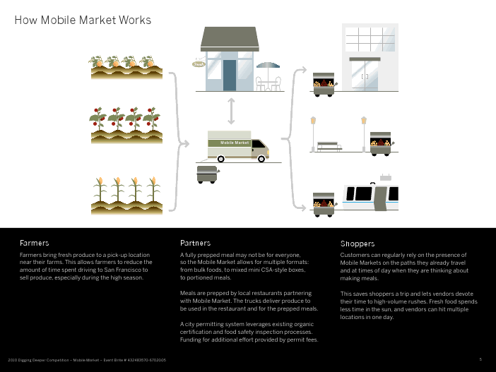
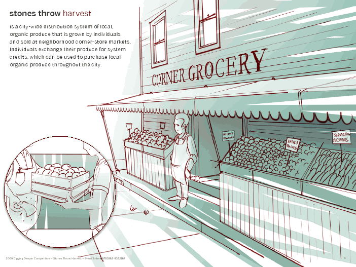
What if getting affordable, local food was as simple as going to the nearest corner store or stopping by a food cart on the way home from work? Frog Design imagines that this is possible with Mobile Market and Stones Throw Harvest, two entries in the Digging Deeper SF competition. The San Francisco-based competition invited designers to "Design an urban agricultural product, system, retrofit, service model, or communication campaign/platform that is simple to set up/manufacture/produce and/or implement/sell/distribute, and maintain within the context of the urban environment with existing neighborhood, city and state regulations"--not a simple challenge to decipher, much less take on. Frog, however, tackled it well.
In the Mobile Market scenario, Frog Design attempted to solve the issue of local food distribution from farms to urban centers. "We're proposing a new way of helping farmers get food to urban centers via carts distributed throughout the city," explained Catherine Sun, one of the Frog designers behind the project. In the proposed system, farmers bring produce to a pick-up location near their farms, and the food is taken to a central location for vendors to access. Carts are placed throughout high-traffic areas in San Francisco. They display both fresh local food and pre-packaged ingredients for meals. An RFID card-reader system for the carts mean that customers don't have to bring cash to get their produce. At the same time, cell phone applications alert customers to the types and quantity of nearby produce and pre-prepped meals. The Mobile Market system allows easy access to fresh produce--no farmer's market required.
The Stones Throw Harvest scenario empowers corner stores to distribute local organic produce. The scenario consists of three parts: store owners, growers, and community. Local certified organic growers who have, say, extra lemons in their backyard lemon tree can bring produce to a corner store in exchange for credits that can be used to purchase other pieces of organic produce throughout the city. Community members on the prowl for quality produce use the Stones Throw harvest cell phone app or website to check out nearby fruits and vegetables. Anyone using the app can rate growers and corner stores in a Yelp-like system--so community members know where to go for the good stuff.
For either of these scenarios to occur, support from the city would be needed. But considering how inaccessible local produce is to people who don't have the time to make it to the farmer's market, both proposals could end up being successful.
Insiders’ Tips: Abigail Ahern | We Heart: Essential Lifestyle Guide
With her hugely popular, ultra-chic Aladdin’s cave of cool in North London, Atelier Abigail Ahern – Elle Decoration called it “one of the coolest places to shop in the UK” – a highly rated, “fabulous new interiors tome” – so say The Times – ‘A Girl’s Guide to Decorating‘, a range of products, concession at Bluebird at continued interior design work, Abigail Ahern is one of London’s most prominent design figures, so you can imagine just how excited we were to get her on board as the first ‘Insider’ for our new regular feature…. if you want to know what an influential interiors guru enjoys in her hometown, read on…..
“Cool stuff in London” by Abigail Ahern
I covet stores that are independent, playful and glamorous – that tantalize my mind and take me on a shopping experience. Particular gems include, Squint, Caravan, Story, The Shop At Bluebird (pictured), Start and of course my own Atelier Abigail Ahern. I am also a huge fan of markets from flea markets like Portobello to food markets such as Borough and my local Broadway market.

Crazy hours makes going out to supper a local experience as the thought of trekking the other side of town induces an instant migraine. Luckily Shoreditch is on my doorstop – über trendy bars that spill out onto the street abound, as do some fabulous eateries including Pizza East (pictured), The Boundary & Lounge Lover.

The music scene is vibrant and often on a Friday night we hang out at our local jazz club Café Otto or the Dalston superstore. The superstore plays a genre-crossing mix of popular music including pop, electro, old school hip-hop and house.

In terms of art galleries Dalston and Shoreditch get my vote its, London’s new Bohemia with many young artists living in and around. The White Cube is the most famous, situated in Hoxton square. The gallery supports most of the famous names in contemporary art in Britain. I am rather into street art at the moment and love Pure Evil’s Gallery in Leonard Street (pictured). All around this area are small little galleries dedicated to primarily up-and-coming artists.
What I am doing
We are in the process of launching our own range of lighting, art, wallpaper and a small selection of furniture, which is hugely exciting. A lack of desirable merchandise has prompted us to put together our very own range, and although its proving rather challenging its also very exciting. The store and our concession at Bluebird also keeps me busy, we have just launched a faux flower shop within our store and its taken off a storm. On the interior design side a couple of residences are underway, as well as a corporate office in London.
Life's a Skitsch - Interior Design Blog
By Rebecca Hoh, idfx
Skitsch, an Italian slang word meaning cool, is also the name of the contemporary design brand that launched in Milan 2009, who marks its first anniversary with the opening of a new 350 sq m store on the Brompton Road. I went along to check out the interesting interior and catch a sneak preview of the new products which will be launched at this year's Milan show.
The interior is actually quite industrial and distressed, despite its swanky South Kensington location, with sawed wooden floors, rough concrete surfaces and glass shelves supported by iron girders. Remnants of wallpaper appear left on the wall that leads you to the ground floor space that has been designed by Studio Pepe.

The new collection sees the company collaborating with a new selection of designers such as French collective 5.5 who has created the Fire Lamp, a blown glass flame that burns on a wood chunk base. Marcel Wanders is also on board with the transformable sofa with its giant quilting and crystal buttons and Dutch designer Bertjian Pot offers Pion, a table lamp of Nomex (a Dupont style material) and will also showcase an installation in the showroom in the near future.
It's definitely an exciting space, with a great set of products shown in a very cool (or should I say skitsch) way, marking a successful first year for the brand. To this end, I am looking forward to celebrating at the official birthday party in the Milan showroom during the design show next month.
ISO50 - The Blog of Scott Hansen » Typography of the Fashion World
In honor of the currently unfolding (ha) Fashion Week in NYC, I thought I’d post on some of the terrific typography at work in the fashion world. When I first got into design, I used to think the typeface for the Louis Vuitton logo was the epitome of graphic design. I remember writing everything in Futura Medium for a good month (even research papers, nothing was spared). These days, I still to pick up the occasional GQ or etc just for the ads — usually can pick up a few interesting things. There are always a number of logos that catch my eye, continue reading to see some of the marks that resonate most.The mark for The Fashion Center (above) is perfectly simple. How brilliant to utilize the button holes to form the F! This is probably one of my favorite logos of all time. What it comes down to for me is that the 5th button hole is slightly smaller than the rest — this subtle scale shift makes the whole thing. Developed at Pentagram.
Selected Typography of the Fashion World
You don’t see too many slab serifs in the fashion world — this one for Iceberg is my favorite. Bally is OK too, but I prefer the “B” in the Iceberg mark for the details (no bottom slab). Also, it’s sort of unfair, but Iceberg is a cooler word and thus I find it more appealing.
Tom Ford probably has one of the most photogenic names in the business. The two words strike a great balance and convey the boldness of the brand very effectively. It announces itself proudly and authoritatively, and is somehow able to be colored pink/violet and still seem completely bad ass.
This one is an uber-classic. Designed by Cassandre in 1963, the Yves Saint Laurent lettering has always had a mysterious air to it for me. Maybe it’s because I could never figure out how to pronounce it. Anyway, the kerning in this one is masterful — just look how smoothly the letters flow into one another.
One of my favorites for its simplicity. The Helmut Lang logo says to me that they don’t mess around — they make classic and quality clothes without comprising their core principle of (stylishly minimal) utility.
Dunhill takes a slightly different approach than most. Seeing the ascenders ascend to new heights is certainly a nice change of pace. It stands out amongst the more typically “restrained” fashion logo. Whether accurate or not, I get the feeling that (like a Paul Smith) there is some extra dose of personality and flare to what they do.
Trussardi has one of the best crests. I’ve seen other brands try this approach (see Juicy), but rarely are they able to achieve such a sense of heritage and refinement like Trussardi. There is even a little touch of playfulness if you look closely at the greyhound in the middle; he looks like he’s up to something.
I love the Hermes identity. The logo is great — especially love the rendering of the horse and buggy — but the real winner for me is the color. If you walk into a Hermes shop, you know you where you are immediately because of the crazy and unusual blends of colors you find yourself surrounded by. A nice contrast to the muted tones of some of the above.
Of all the script logos in the fashion world, Paul Smith is my favorite. It’s hard to imagine the brand without his signature color rainbow, but I think the lettering alone still does a great job summing up what the brand is all about. Seeing this lettering inside of an extra sharp suit somehow makes complete sense, especially when you see that the lining is bright purple.
I know I said Paul Smith was my favorite hand written face, but Salvatore Ferragamo comes pretty close. Each letter is wonderfully drawn if you take them individually — they all have interesting little quirks and imperfections that come together nicely. It’s hard to tell if I like this one because of the actual rendering or just prolonged exposure.
This condensed face is not the official logo of Zadig and Voltaire, but I enjoy it anyway. Their current logo (which you can see on their site) is great, but my love of condensed type always led me to prefer this one. I suppose the current one has more personality (especially in that “g”!) in the end.– -
Definitely left a few out I know; Chanel, Louis Vuitton, maybe even American Apparel. Let me know if there are any others!
